Sometimes, two or three colors just look right together. We can’t explain why, but we know it’s right.
Color theory is the explanation you’ve been looking for. Even if you haven’t been looking for that explanation, that’s no excuse not to know it.
Color theory is important for everybody to understand. If you have a job as a freelance graphic designer or an interior decorator, color theory can easily be applied. Web designers who want to make their sites accessible must understand color contrast; entrepreneurs designing their packaging and logos should understand how colors make their audience feel.
The understanding of color theory plays an enormous part in the success of all designers and brands, big and small.
Why guess the reason a few colors look good together when you could know the answer?
What is color theory?
Color theory is both the science and the art behind beautiful design. It explains how humans interpret color as well as the effects that colors have when they are contrasted or matched with one another. Color theory includes color wheels, definitions, concepts, and applications.
There’s quite a bit to learn here.
The color wheel
While we think of color as something used in art, the color wheel truly originated in science; Sir Isaac Newton developed the first color wheel and published it in 1665 while studying white light and reflection. Check out the evolution of the color wheel below.
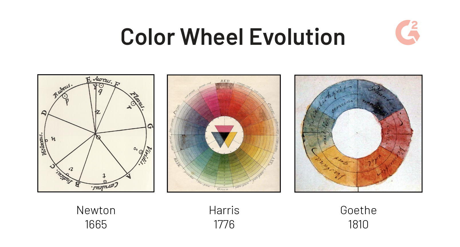
Newton’s theory tied colors to musical notes. As it was adopted by others, these colors were tied to psychological theories instead, hence the familiar sounding term: color psychology.
As technology grew, two color wheels appeared: RYB and RGB.

The RYB color wheel is the wheel used by artists because the combinations on that wheel apply better to paints and other, printed combinations of color. The primary colors in this model are red, yellow, and blue. As color printing came into existence, red was replaced with magenta; blue was replaced with cyan; yellow remained yellow; and black was added to create the color mode CMYK.
The second is the RGB color wheel which is designed for online use because it mixes colors that are backlit by a screen such as a computer monitor or television. The primary colors in this model are red, green, and blue. Knowing the difference between RGB vs CMYK isn’t just trivial; it’s necessary for digital designers.
Tip: If you want to make sure there’s absolutely no chance of variation while printing your colors, be sure to check out Pantone.
For the remainder of this article, we’ll refer to the RYB wheel. Because that’s what we learned in kindergarten.
Vous voulez en savoir plus sur Logiciel de dessin ? Découvrez les produits Dessin.
Types of color schemes
There are several relationships that exist between colors on the color wheel. These relationships are called color combinations or color schemes. There are six color schemes that every graphic designer should be familiar with when trying to choose colors that go well together.
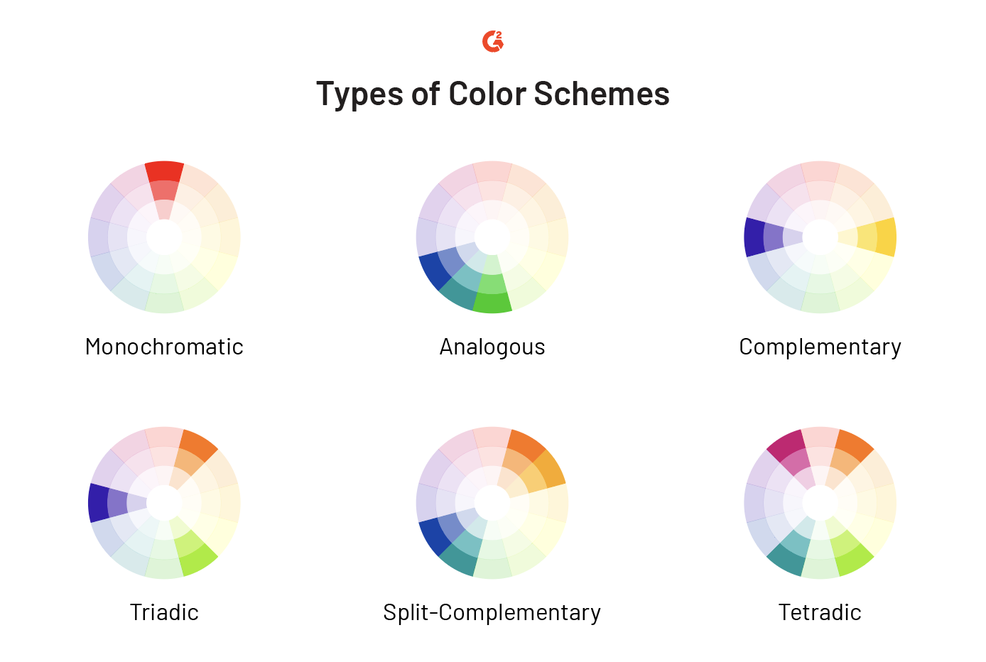
- Monochromatic: varieties of one color
- Analogous: colors next to one another on the color wheel
- Complementary: colors directly opposite one another on the color wheel
- Triadic: three colors that are evenly spaced apart on the color wheel
- Split-complementary: two complementary color schemes that are next to one another on the color wheel
- Tetradic: two complementary color schemes that are not next to one another on the color wheel
Having a more in-depth comprehension of these relationships will help both designers and other professionals make more educated decisions about the colors they use in future designs, whether it be for an illustration or a logo.
Primary, secondary, and tertiary colors
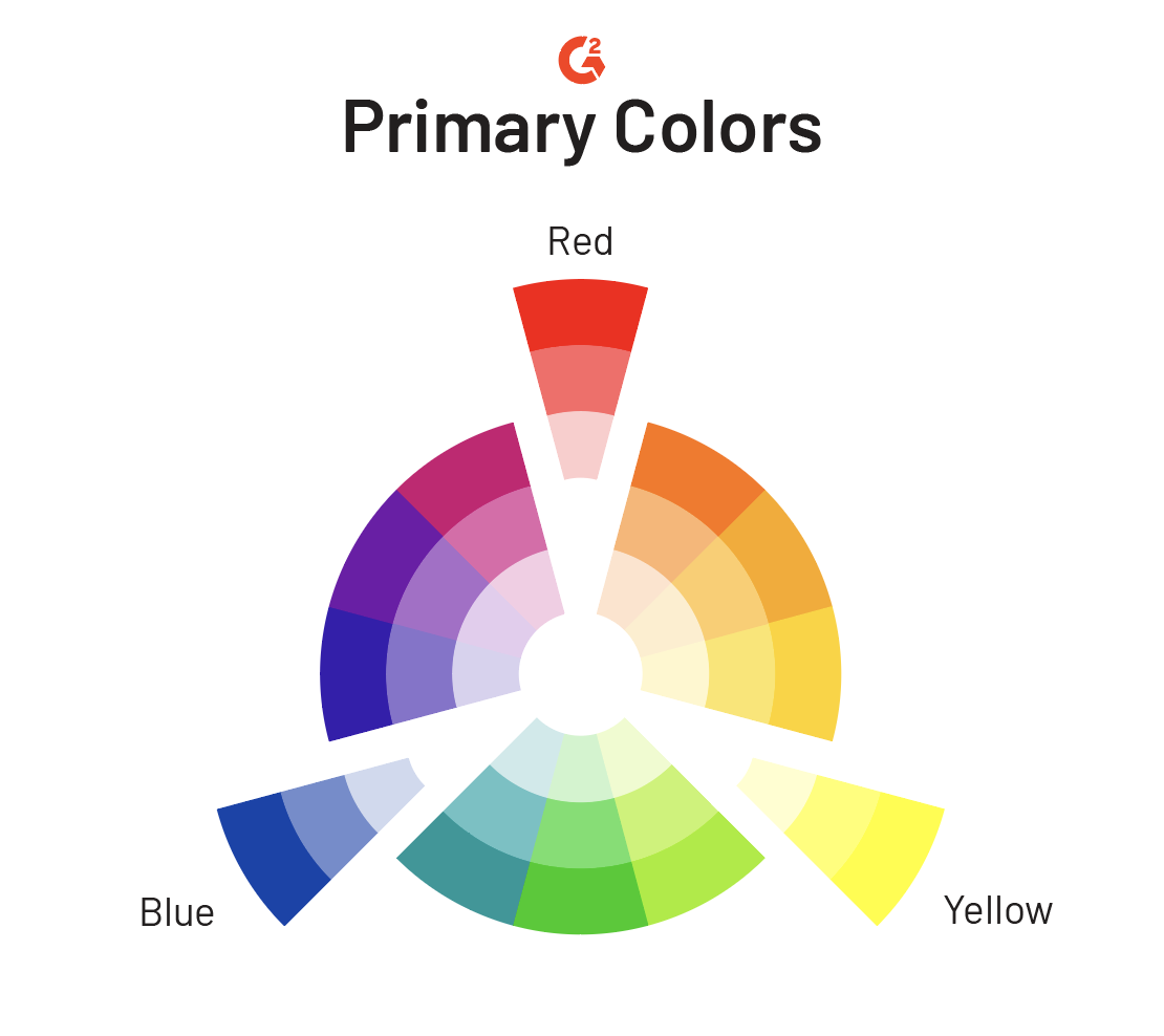
The color wheel consists of twelve colors: three primary, three secondary, and six tertiary.
Primary colors
Primary colors are the three colors on the color wheel that cannot be formed by mixing other colors. Red, yellow, and blue are the primary colors on the RYB color wheel. Hence their initials make up the wheel's name.
Secondary colors
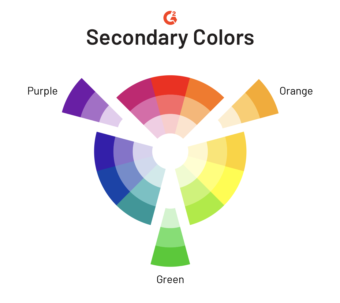
Secondary colors are simply the colors that are created when mixing any two primary colors together. There are three possible combinations that can be made, and therefore three secondary colors on the color wheel.
- Red + Yellow = Orange
- Yellow + Blue = Green
- Blue + Red = Purple
Tertiary colors
Tertiary colors are made when primary and secondary colors are combined. There are six tertiary colors on the color wheel.
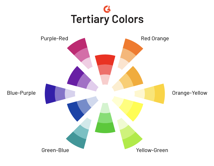
These colors are simply named after their combined parents.
Warm and cool colors
The color wheel can be divided in many ways; we just reviewed three. An additional way that these colors can be divided is by their temperature. The warmth and coolness of colors bring different feelings to the person viewing the color.
Warm colors often evoke feelings of happiness and energy; cool colors evoke feelings of calm and serenity.
Warm colors range from red-purple to yellow. Cool colors range from yellow-green to purple.
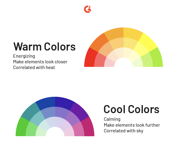
Sometimes it’s not as simple as it seems. Depending on what end of the spectrum of the particular color it sits on, some colors can shift between warm and cool. For example, a red with more orange can look and feel warmer than a red with hints of purple and blue.
Additional terms
There are a few terms within the subject of color that often become confused but are important to understand.
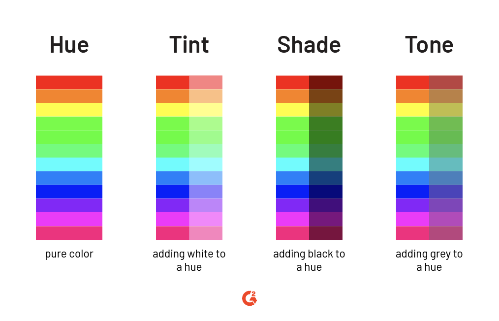
- Color is the term that we use to describe any and every shade, tint, tone, and hue. Red is a color, light red is a color, dark red is a color, and so on.
- Hue refers to the overall color family and the origin of the color we see. In this example, red is the hue. To simplify things, hues are one of the six primary or secondary colors: red, orange, yellow, green, blue, or purple. Black, white, and grey are not ever referred to as hues.
- Shade refers to any hue mixed with the color black. A shade will darken the version of the original hue.
- Tint refers to any hue mixed with the color white. This will lighten the color but does not brighten the color (even though it may appear to be brighter). Tints are simply the washed-out version of the original hue.
- Tone refers to any hue mixed with the color grey. Adding grey to a hue, it tones down the intensity.
The rainbow connection
Colors are more than beautiful: they’re connected. There’s the reasoning behind why some look good together while others don’t and why some make you feel happy while others make you feel sad. You don’t have to be a graphic designer to take this knowledge and run with it: color is for everyone.
Discover more about the other skills you need to learn if you want to work as a graphic designer.

Daniella Alscher
Daniella Alscher is a Brand Designer for G2. When she's not reading or writing, she's spending time with her dog, watching a true crime documentary on Netflix, or trying to learn something completely new. (she/her/hers)
