

Knowing the difference between two things that are very similar can feel trivial.
What are you going to do with your knowledge of the difference between alligators and crocodiles? Show off at a party?
Even while using graphic design software, the difference between typeface vs. font is one that has little impact on our understanding of the overall concept. On the contrary, the difference between color modes is more than just a fun fact, not knowing the difference can make or break your graphic design project.
What is RGB?
RGB is all about seeing the light.
Computer screens show color in images, text, and designs with different combinations of red, green, and blue light. This is where RGB comes from. Therefore, anything designed for a screen – from smartwatches to a jumbotron – should be designed in RGB color mode.
Screens display images with hundreds of pixels. Each of those pixels has three sub-pixels: a red light, green light, and blue light. These sub-pixels light up in different intensities based on the color the pixel ultimately displays to produce a result on a black monitor.

The screen you’re reading this article on is made up of hundreds of pixels. These pixels come together to display the words and images that you see.
RGB values are displayed in a range between 0 - 255, meaning that there are 256 levels of each of the three colors (red, green, and blue) that can be combined together to create a color on the spectrum between black and white. This means that there are over sixteen million possible colors in the RGB color mode. That’s a lot of options.
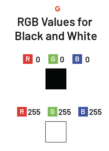
For example, the RGB value for the color black is:
This means that there is 0% red light, 0% green light, and 0% blue light. In other words, there is a complete absence of light, resulting in black.
To create white, a designer should input:
This is the highest possible value of each color, meaning that red, green, and blue lights are 100% bright, resulting in the maximum presence of light: white.
Another way to think about RGB color mode is by referring to red, green, and blue as additive colors. This means that RGB creates other colors by adding quantities of red, green, and blue together.
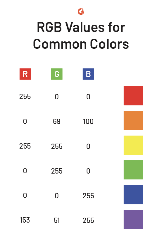
Here are the RGB values for some traditional and popular colors.
Want to learn more about Graphic Design Software? Explore Graphic Design products.
What is CMYK?
Not everything we design can be put in front of bright lights. Therefore, designs that are intended for print should be designed in CMYK mode.
The name CMYK comes from the four colors that make up the model: cyan, magenta, yellow, and key. The key represents the color black. Since “B” is taken by “blue” in the RGB model, the last letter of the word “black” is used instead of the first.

Black is used in this color mode because even the purest combination of cyan, magenta, and yellow (all lighter colors) cannot create a fully black color.
CMYK uses subtractive colors, not additive. Adding colors together in CMYK mode has the opposite effect on the result as RGB does; the more color added, the darker the results. Therefore, colors are taken away or subtracted to create a light result.
This is because the CMYK colors absorb light, meaning that more ink results in less light. Combining cyan, magenta, and yellow will create a deep brown. It isn’t until the key (black) is added that the color is removed completely.
The CMYK values are measured in percentages. For example, to make the CMYK color white, the values should be entered into the design software as:

Interestingly enough, setting CMY to 0% and K to 100% does not create the darkest black possible.
To create a “true” black, the following values should be entered:
This is called “rich black” or “Photoshop black” and is a much more pure black because it absorbs the most light. This color isn’t used often because the physical amount of ink that it takes to produce it can rip lower-quality paper. That’s intense.
Additionally, using too much ink encourages smearing, which makes the text much more difficult to read. When using black, there are a few different versions that are used by designers that won’t rip a hole through your project.
- Cool Black: 60 . 0 . 0 . 100
- Warm Black: 0 . 60 . 30 . 100
- Designer Black: 70 . 50 . 30 . 100
- Rich Black: 75 . 68 . 67 . 90

Here are the CMYK inputs for some traditional and popular colors.

CMYK vs. RGB
Simply put, CMYK is the color mode intended for printing with ink, such as business card designs and posters. RGB is the color mode intended for digital communication, such as websites and television.
The more color added in CMYK mode, the darker the result. The more color added to RGB, the lighter the result.
CMYK has a numerical range of 4x100; RGB has a numerical range of 3x256. Therefore, the energetic colors that RGB can produce are difficult to reproduce in CMYK.
When designing, the biggest mistake you could make is forgetting to convert to the appropriate color mode for your project. If you forget to do this, colors could appear washed out or too vibrant.
Not sure how to convert?
Take a look at some of these resources to make sure you’re doing it right.
Final thoughts
As a designer, it would be a real shame if the colors you carefully picked for your project don’t turn out the way you intended. Just as we need to be careful about fonts, element sizes, and spacing in our designs, color is another aspect to keep your eye on. Having a better understanding of how these modes work can’t hurt.
Designing can be overwhelming when considering all elements but fear not, you don't have to go it alone. Discover the art of creative collaboration to bring your content to life, from ideation to seamless publishing.
Daniella Alscher
Daniella Alscher is a Brand Designer for G2. When she's not reading or writing, she's spending time with her dog, watching a true crime documentary on Netflix, or trying to learn something completely new. (she/her/hers)

