

There are some colors that just look wrong together.
Brown and lime green? Ew.
Some of us just don’t have the eye for combining colors to make beautiful designs. As a graphic designer, or any designer for that matter, it’s important that you understand the different combinations and relationships that colors have with one another in order to make sure that you’re putting them together in a way that just looks right.
It doesn’t matter if you’re designing an entire website or a disposable print ad design. Designers often have to play around with color schemes for a long time before finally feeling like they have it right. Before we start learning about how to avoid wasting time doing this, let’s learn what a color scheme really is.
What is a color scheme?
A color scheme is the group of colors chosen by the designer, graphic or otherwise. Ideally, these colors are aesthetically pleasing and should appeal to the viewer.
There are millions of color schemes that you could use in a project, but that doesn’t mean they’re all good choices. If you want the viewers of your project to feel comfortable, it’s best to get an understanding of the relationships that colors have with one another.
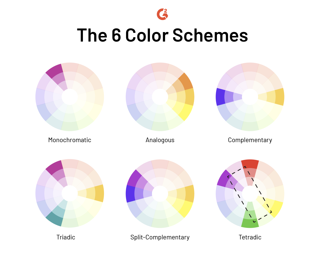
6 color schemes
1. Monochromatic color scheme2. Analogous color scheme
3. Complementary color scheme
4. Triadic color scheme
5. Split-complementary color scheme
6. Tetradic color scheme
Below, we’ll go over each of these six color schemes and what designers should know about each of them.
1. Monochromatic color scheme
A monochromatic color scheme is somewhat similar to combining typefaces from the same family, while font pairing in that monochromatic color scheme is the variation of the same hue. The variations are made by adjusting the shades, tones, and tints.

Tints are made by adding white to the hue, while shades and tones are created by adding darker colors to the hue.
This is arguably the easiest choice to make when looking for a color scheme, there are almost no danger zones in taking this route for your design. The largest problem one could run into would be overdoing it–a poster made up of only shades of purple is something to be tread on lightly.
 Source: Morphe
Want to learn more about Design Software? Explore Design products.
2. Analogous color scheme
Analogous color schemes are color combinations made up of those that are next to one another on the color wheel. Because of their physical closeness on the color wheel, they often look similar to one another and therefore make a good-looking color scheme.
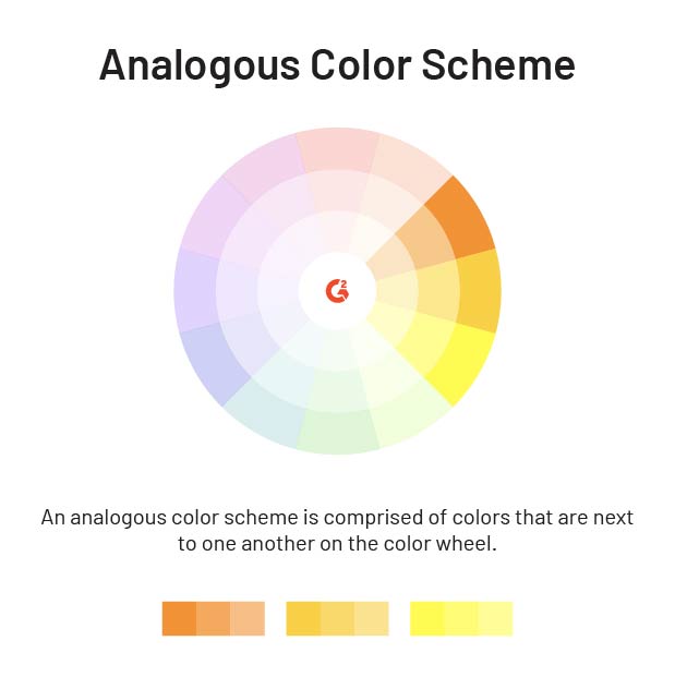
In design, it’s best not to spread these colors out evenly. Instead, choose one color to dominate while the other two accent it.
 Source: Behance
3. Complementary color scheme
Sometimes, opposites surprise us and really do attract. Complementary colors can be found on the color wheel by choosing one color and the color directly across from it. Opposites really do attract.  Using this color scheme makes different elements extremely distinct from one another. It translates intensely, so if that’s the vibe you’re going for, use this color scheme to your own advantage. If the design you’re creating isn’t meant to be received in that light, avoid it.

Source: Happy Collections
Don’t mute out colors when using this color scheme; this only lessens the exciting effect it creates. The vibrance of each color encourages eye movement, drawing viewers from one element to the next.
4. Triadic color scheme
While not necessarily the easiest, triadic color schemes are the safest bet if you’re looking to go outside of one hue. Triadic color schemes are combinations of three colors that are evenly spaced apart on the color wheel.

Triadic color schemes provide viewers with strong contrast, similar to a complementary color scheme. However, triadic color schemes achieve this effect without disturbing the peace.

Source: GIMP
5. Split-complementary color scheme
This color scheme uses two complementary color schemes that land right next to one another on the color wheel. This achieves the same head-turning ability as complementary color schemes but provides designers with a few more color options.

Using this scheme suggests a little more confidence in the color choice than if a designer were to design with just two complementary colors. Split-complementary is still heavily contrasted, it just takes a little bit of the weight off of your eyes.

Source: Chris Carter
6. Tetradic color scheme
Also known as the double-complementary color scheme, this scheme is made up of two complementary pairs. Another name for this (yes, this is a lot to remember) is “rectangular colors” because these colors can be found by creating a rectangle on the color wheel.

These colors can be a little alarming to look at, especially if they’re divvied up into equal amounts. To avoid turning heads the wrong way (away from your design), choose one of these colors to act as your dominant color and let the other three colors act as accents.

Source: The Luminous Landscape
Once you understand the relationships between all of these colors, you can begin to apply them to your newest graphic designs.
Start scheming
Not in a devious way, but in a colorful way! Understanding the relationships between colors can help you not only in your designs but can give you an appreciation of the designs of others. Whether they’re man-made or a creation of Mother Nature, color schemes are apparent in our everyday lives.
To thrive as a graphic designer, mastering color schemes is essential, but it is equally important to stay informed about other skills to stay competitive in the ever-evolving industry. Discover the graphic design skills that every employer seeks to ensure your success.
Daniella Alscher
Daniella Alscher is a Brand Designer for G2. When she's not reading or writing, she's spending time with her dog, watching a true crime documentary on Netflix, or trying to learn something completely new. (she/her/hers)


