
Yesterday was sunny and 85 degrees. Today, it’s a cold, windy, and rainy 54 degrees.
That’s contrast.
Designers have the opportunity to keep things homogeneous; fonts, elements, layouts, and sizing could all stay consistent and the world wouldn’t end.
But that’s not how design works – we’re trying to make things different, stand apart, and say “look at me!” So, we learn about font pairing, we use multiple elements, rework our layouts, and resize and realign our content to make things more interesting and accessible for the viewers.
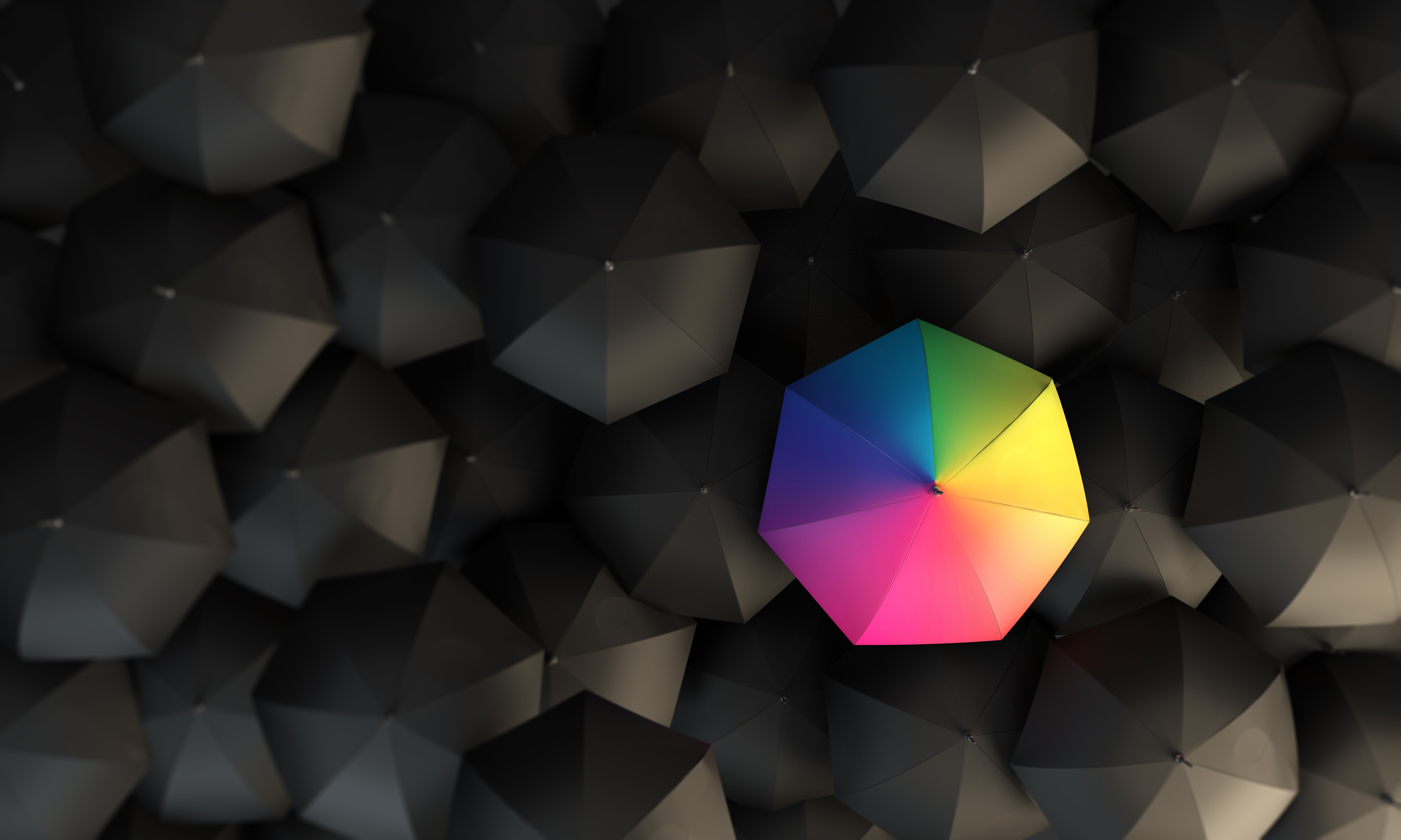
Color contrast is another element that designers play with not only for aesthetic effect but overall accessibility.
Color contrast in design
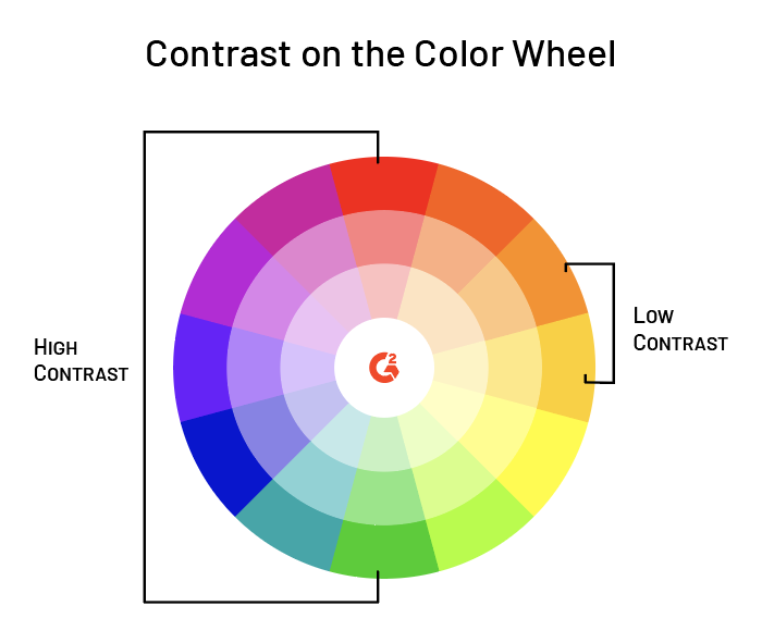
The word “contrast” simply means “difference”.
What is color contrast?
Contrasting colors are colors that differ from one another. Levels of contrast vary from high to low, depending on their position on the color wheel. For example, colors that are directly opposite one another on the color wheel have the highest contrast possible, while colors next to one another have a low contrast.
For example, red-orange and orange are colors that have low contrast; red and green are colors that have high contrast.
While many contrasting color schemes are interesting and sometimes even aesthetically pleasing to look at, contrasting colors serve an additional purpose: user accessibility.
Color contrast for the sake of aesthetic
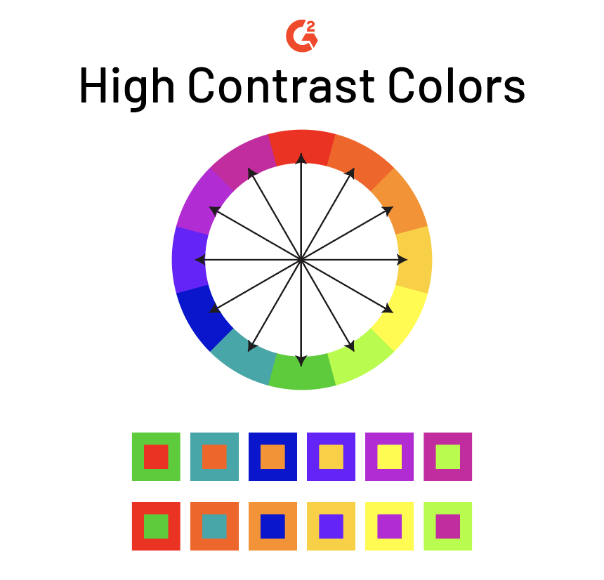
To say the least, choosing high contrast colors for a design is a bold move. Below are examples of high contrast colors. These pairs are directly across from one another on the color wheel.
They’re definitely a lot to look at. But sometimes, boldness pays off. Don’t those colors look a little familiar?
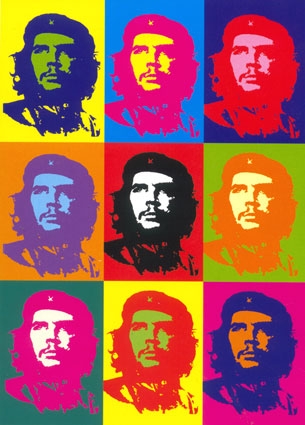
Source: Gerard Malanga, Andy Warhol
Art and design that uses high contrast colors really “pop”. Looking at designs like these creates a unique experience, but has a tendency to become a little painful.
Because of this liability, high color contrast is not always the best idea to use in design. At the same time, low color contrast can also be a bad idea; using these schemes makes it hard to differentiate between elements.

While designs with low contrast have an aesthetic of their own, they’re not always the best choice for marketing materials or packaging design.
Using color contrast in physical products is all about finding a balance between the highs and lows. In basic design, there’s no formula for good contrast; it takes a good eye and a lot of practice.
Want to learn more about Drawing Software? Explore Drawing products.
Color contrast for the sake of accessibility
Color contrast is more than just an aesthetic; it’s also a necessity, especially on the web. The most important thing to remember here is that if you’re building a website, drafting a presentation, or designing an infographic, it is crucial that the information provided is accessible to everyone involved.
One of the best ways to do this is to ensure that the colors you are using in your design – graphic or web – have high contrast.
Contrast on the web
WCAG (Web Content Accessibility Guide) 2.0 provides specific guidelines to ensure that the color contrast between foreground (text, images, etc.) and background is appropriate by using a ratio. This ratio also varies based on the size and weight of text being used.
WCAG 2.0 expresses that contrast is a measurement of the difference in perceived brightness between two colors. This difference is indicated with a ratio between 1:1 (lowest possible contrast; white text on white background) and 21:1 (highest possible contrast; black text on white background or vice versa).
The WCAG’s listed contrast minimum is a ratio of 4.5:1 with the exception of large text, logos, or intentional low contrast on the web. Hexadecimal values of the colors in use are necessary in order to measure the contrast.
| DEFINITION: A color hexadecimal code (hex code) details the composition of a specific color in an RGB colorspace. It is made up of six characters, both numerical and alphabetical. The first value pair refers to red, the second to green, and the third to blue, in hexadecimal values 0-FF (#RRGGBB). |
This is all a little confusing. Let’s put it into practice.
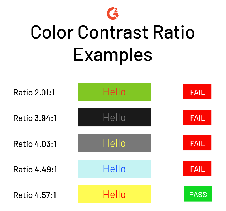
While some of the above text may be readable for you, it may be difficult or impossible for others with vision impairments to read. Even the last option with a 4.57:1 ratio is difficult to look at. Remember that 4.5:1 is the minimum.
Including appropriate contrast is just one of the many web design elements necessary for a great website. Not sure if you're doing it well enough? Color contrast checker software can help you ensure that the color palette you're using is optimized for the best user experience possible.
Can you read me now?
Nope! Look at that, a perfect example of how this conclusion’s header is 1. ugly and 2. impossible to read.
You can read studies on color contrast, color blindness, and accessibility, but there’s nothing like experiencing this frustration firsthand. It’s not pleasant, so do your duty to make sure your users and viewers don’t experience it either.
Contrast appears differently, depending if your project is printed or digital. Learn more about the difference between RGB vs CMYK.
Daniella Alscher
Daniella Alscher is a Brand Designer for G2. When she's not reading or writing, she's spending time with her dog, watching a true crime documentary on Netflix, or trying to learn something completely new. (she/her/hers)

