
There’s a lot of content out there. You’re reading some right now. Hi!
For the audience’s purpose, it’s important that the content is organized. Books have chapters, movies have scenes, and podcasts have episodes.
That same organization also needs to be applied to page layout, both digitally and on paper. This can be done by applying hierarchy to your design elements. Adhering to visual hierarchy is just a fancy way of saying information is being organized from most important to least important.
The viewer defines what is most important to them; the designer just gives them some hints.
Whatever piece of information the viewer sees first is determined as most important, and therefore sits at the top of the hierarchy. The elements that gain the viewer’s attention next are what rank lower on the visual hierarchy.
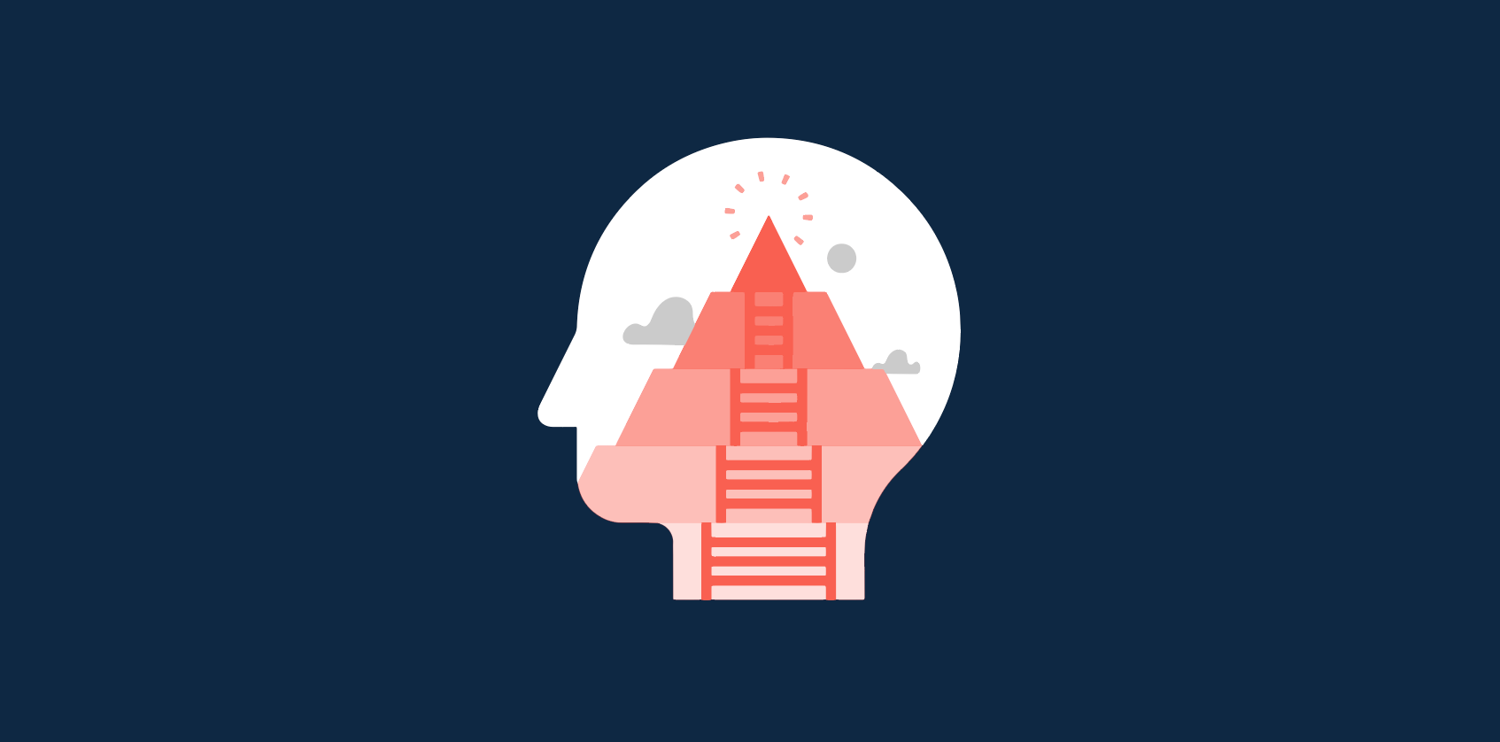
Understanding visual hierarchy
Visual hierarchy plays a large role in UI design. Think about what a good landing page looks like: logo of the company at the top, menu at the top or on the left, elements of little importance towards the bottom. These elements are placed with a purpose.
What is visual hierarchy?
Visual hierarchy is the arrangement of elements in a design by the order of importance in each element. The visual weight, or the visual contrast, that each element carries is what defines its importance in relation to other elements in the design.
The following principles should be seen as the golden rules of visual hierarchy. These guidelines help graphic designers produce results that draw attention to all of the right places, all while being nice to look at.
Using desktop publishing software can help graphic designers layout all of their materials neatly onto one page with the help of guides, templates, and additional tools to help refine layouts.
Even non-designers can take advantage of this; visual hierarchy comes into play when designing presentations for meetings so that those in attendance can easily understand the points you’re trying to have to make (without hearing a word you’re saying).
Size and scale
You’re more likely to hear something the louder it is. There is no auditory volume in visual hierarchy, but the size and scale of elements have a similar effect.
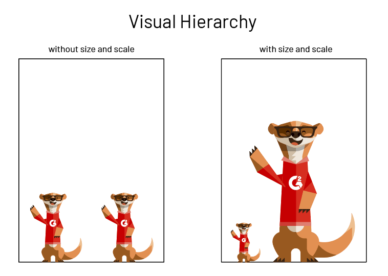
One of those Montys is clearly more important than the other.
The larger an element is, the more likely we are to see it, moving it towards the top of the hierarchy.
Elements that aren’t as important can be made smaller to reduce visibility and emphasis. This moves these elements towards the bottom of the visual hierarchy.
This doesn’t necessarily mean that the most important elements have to be enormous. Use size in moderation and keep it tasteful; elements that are too large can overwhelm the rest of the design, while elements that are too small can be lost in translation.
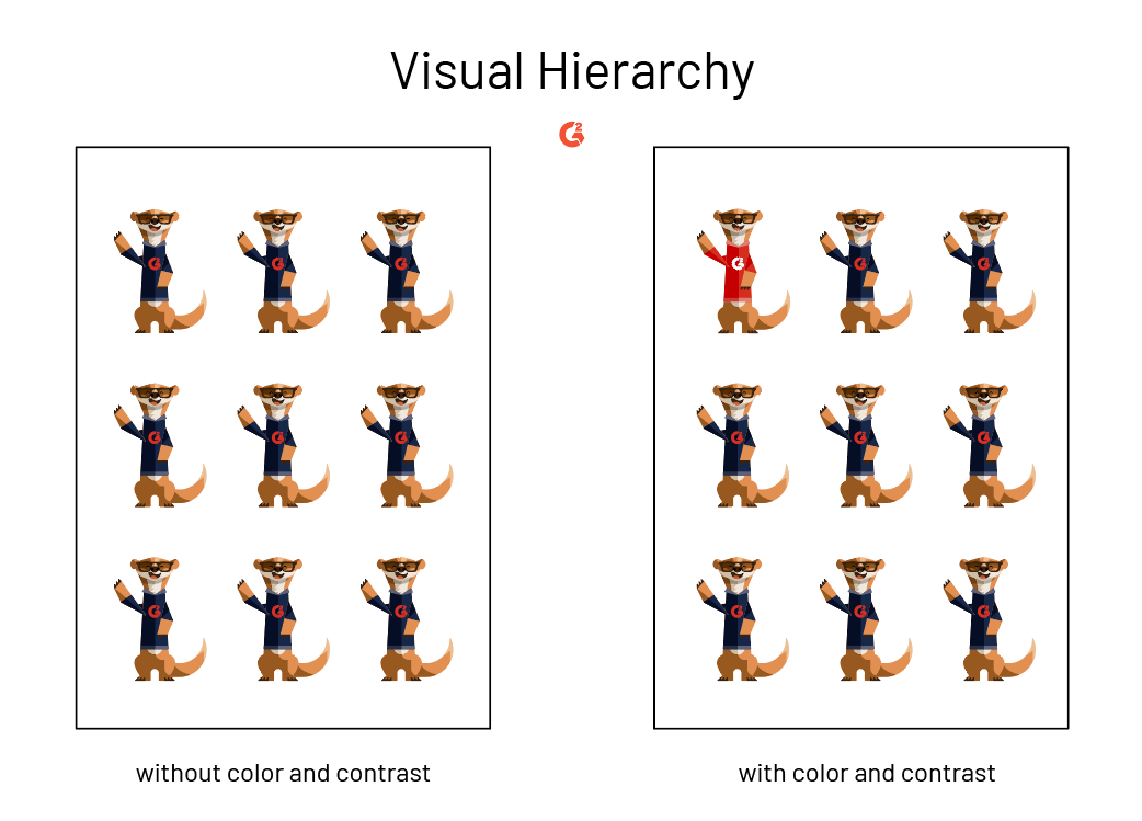
Color and contrast
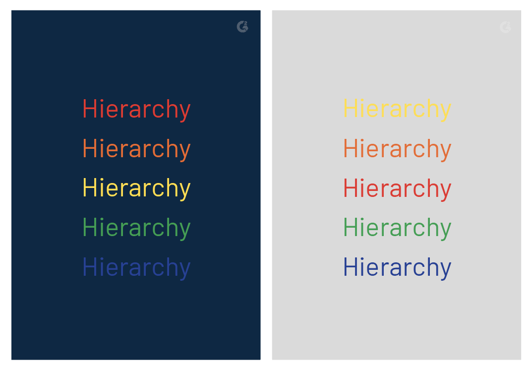
Another way to make important elements stand out to the viewer is with color and contrast. In a world (or website) full of black and white, a little color makes a big difference.
Dress your most important information or elements in a bright color to make them pop against a paler hue. Think of the effect that highlighting in a textbook has; if singular words or sentences are in a brighter color, they’ll draw the reader’s attention before any other words stand a chance. If there’s already a colorful background in your design, you can do this by using contrasting color schemes.
High contrast will pull out any major points you want to convey.
Contrasting colors has another effect in visual hierarchy: it alters the perceived distance of elements. Warm colors will stand out against dark backgrounds, making them appear closer than cool colors on a dark background. Conversely, cool colors stand out over a light background, making them appear closer than warm colors on a light background.
| TIP: Color theory is important to understand when designing for visual hierarchy. |
Again, use color and contrast in moderation – overuse can confuse viewers because, suddenly, everything will look important and it will be impossible to know where to turn. Remember, visual hierarchy is supposed to serve as a guide.
Fonts
We’re not talking about putting Times New Roman and Curlz together and making them compete for importance. A typeface like Times New Roman is made up of fonts; varying weights, sizes, and styles of Times New Roman. For example, Times New Roman Italics in 16 pt is a different font than Times New Roman Bold in 36 pt.
| RESOURCE: Learn more about the difference between typeface vs font. |
Taking advantage of these weights, sizes, and styles is what can move information higher (or lower) on the visual hierarchy. These can be used individually or together to make some words more apparent and powerful than others.
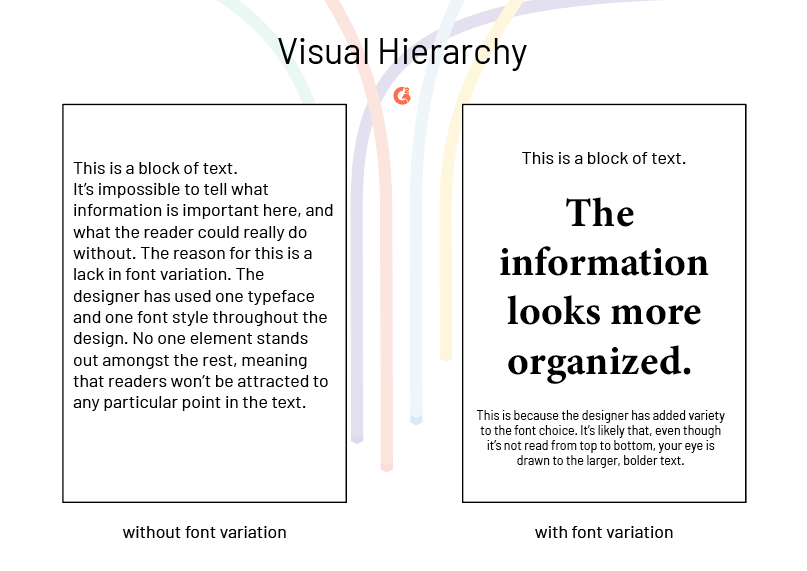
A single typeface can be used throughout a design, but a variety of fonts within that typeface still have the power to arrange the textual elements by their importance.
Bigger and bolder means more important, while smaller and thinner text becomes secondary. Don’t mix this rule up–it could make a document look a little strange if not applied correctly.
Typographic hierarchy
You don’t have to guess where to place those fonts. Think about what a newspaper or magazine layout looks like: heading, subheading, copy. This is the most basic approach and it can be applied to a multitude of designs, including business cards, brochures, and articles.
| Level 1 typography will be the most important content on the page. These are often headers and should be the first thing the reader sees. |
| Level 2 typography should also stand out, but not as much as your level one. These should help organize your design into groups or sections with related information. It should break up the text and insinuate some direction to readers. |
| Level 3 typography is used when the page is mostly made up of text. This level is often the body of the content, and is often the smallest size font, but should still be legible. |
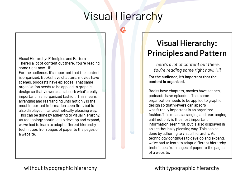
Using these different levels is another way to indicate what’s important for the reader without having to put it in neon lights.
Negative space
If you want to draw attention to a specific piece of content, try to give it some breathing room. Negative space left around a form, button, or important piece of text makes it look like the odd man out. In a good way.
While you may think adding more elements to your page will make it look better, the opposite is true; your page becomes cluttered and full of information that’s hard to separate by importance.
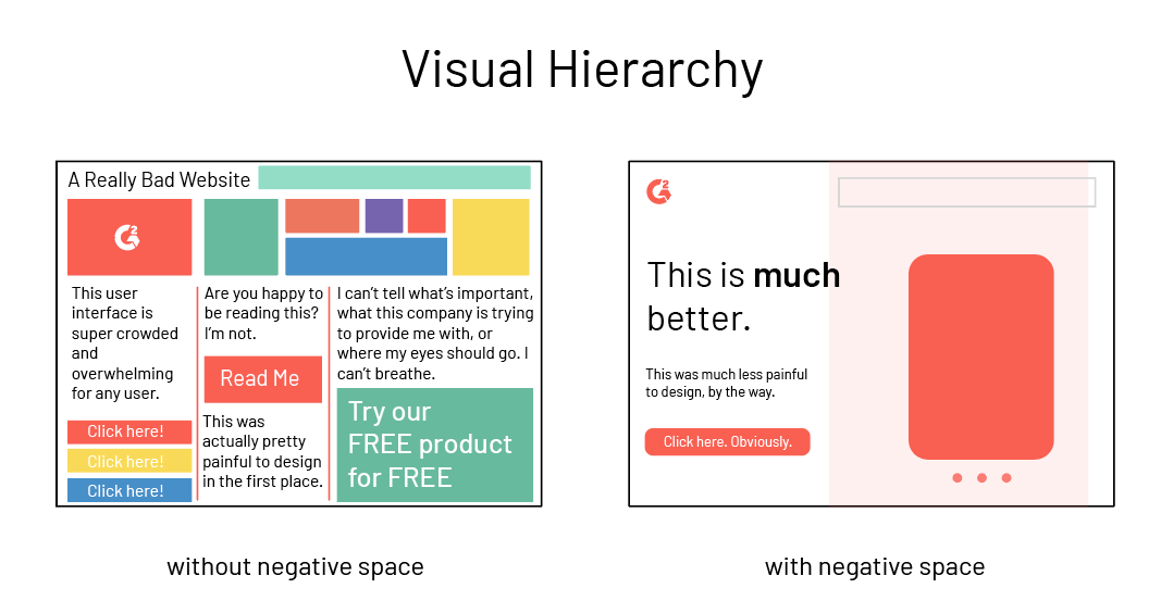
White space is not a waste. Instead, it gives viewers and readers a little time to breathe before moving on to the next element, and can help to turn important elements into focal points instead of just looking like another cog in the machine.
Reading patterns
Across all cultures, humans read from top to bottom. This is the most predictable way in which our eyes read, but what if we only have time to scan? There are two patterns that the human eye may follow when absorbing information quickly, whether it’s an illustration, website, or printed article.
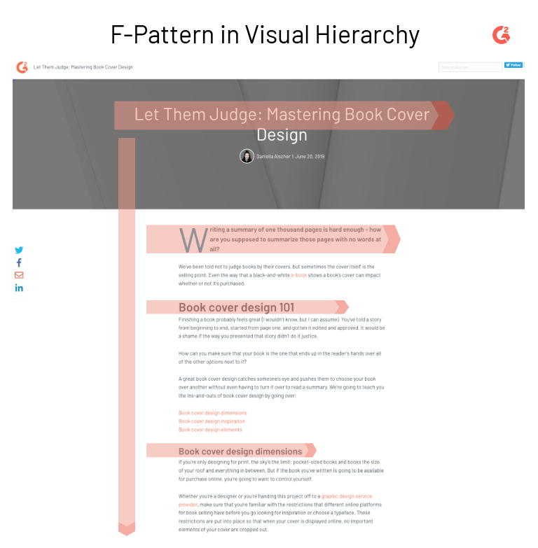
F-pattern
F-pattern typically applies to how we read text-heavy pages, like the one you’re on now. A reader will scan the page in the shape of an “F” (or “E”): first, across the top of the page to read the headlines, then down the left side of the page to look for numbers or bullet points, and finally across the page to look for underlined or bolded terms.
Z-pattern
Designs with more imagery and fewer blocks of text are typically put together in a Z-pattern.
In this pattern, a reader will scan across the top of the page from left to right. This is where the most important information is found on websites.
The reader’s eyes then move down and diagonally to the opposite corner and scan the lower part of the page in the same way they scanned the top, thus forming the shape of a “Z”.
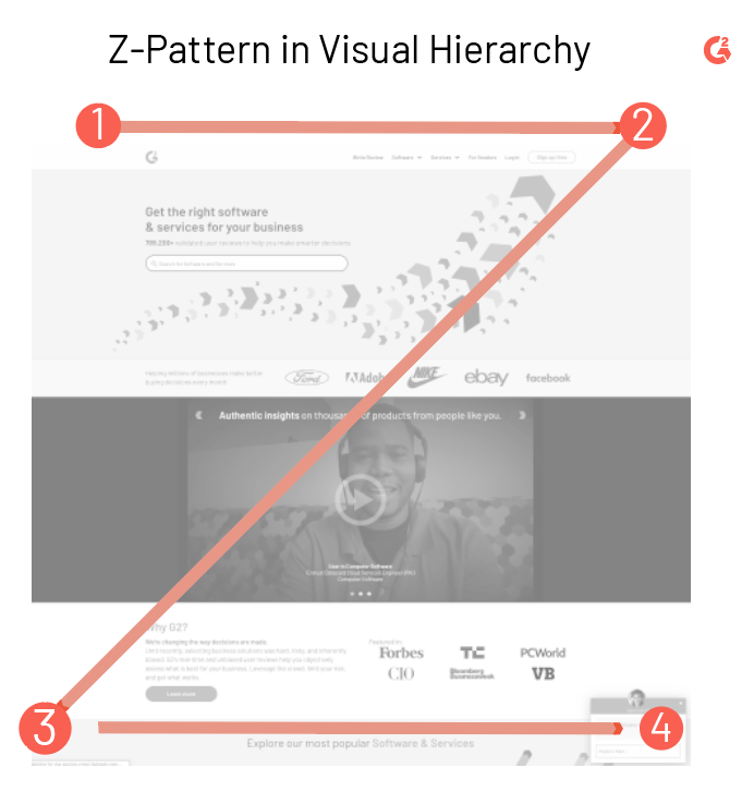 A large number of web pages are designed in this fashion; web designers are pretty smart. The most important information is almost always on that top bar: a logo, search tool, navigation tabs. The bottom bar, which is connected by the diagonal line of the “Z”, includes other important information such as a chatbot, contact information, or links to other pages on the site.
How important would you say the information below this header is?
It’s a Header 5, the smallest one on the page. We’re concluding the article here, so we’re about to wrap up everything you’ve already read, meaning that, while important, you’ve already read this information. The most important information was the title; that’s what told you what you were about to be reading. Because this is text heavy, you probably scanned those jump links, then went across the page to check out any extra links we gave you. You’re welcome.
Visual hierarchy is effective, powerful, and not something to be overlooked when designing, especially if you have important information to share. No principle is more important than another, as they all involve ways in which you can make the information that you need to stand out really jump off the page.
Want to learn more about Website Builder Software? Explore Website Builder products.
Daniella Alscher
Daniella Alscher is a Brand Designer for G2. When she's not reading or writing, she's spending time with her dog, watching a true crime documentary on Netflix, or trying to learn something completely new. (she/her/hers)

