

There are infinite ways to lay out a finite amount of information.
Endlessly scrolling, looping GIFs, and constant refreshing keep us engaged on social media. But magazines can't rely on constant updates. Getting the layout right the first time is crucial.
Books are linear experiences; read cover to cover. Magazines offer choice – readers pick and choose articles. A captivating cover might be enough to sell a book, but magazines need to grab attention on every page. A poorly designed spread can mean your publication gets tossed. Let's avoid that.
The good news? Magazine layouts are flexible – there's no single "best" way. However, this freedom can be overwhelming. That's where UX design services can help.
However, if you want to be the expert, here are some additional layout tips to get you started.
6 actionable tips for a magazine layout
- Know your content
- Master your master pages
- Conform to consistency
- If it's important, make it known
- Align your body copy
- Multimedia is a must
Tip 1: Know your content
It's impossible to design a layout without knowing what you're laying out.
Before getting started, have a solid idea of exactly what will be included in the magazine issue. What will the graphic-to-text ratio be? How many stories will the issue include? Are there any special elements that need to be woven in?
One way to keep everyone on the team, whether editors, designers, or otherwise, on the same page, is with some great project management software. Not only can it help designers like you stay on top of your game, but it can also assist entire teams in organizing multiple magazine issues (or other projects) and allow administrators to assign varying tasks to individual team members.
It’s nothing less than essential that you and your team have a common understanding of what goes into the issue; skipping this step could result in the publication equivalent of disaster. Alternatively, taking this step can help abbreviate the tremendous amount of ideas your beautiful brain has conjured into a smaller number.
Want to learn more about Vector Graphics Software? Explore Vector Graphics products.
Tip 2: Master your master pages
Creating these layouts from scratch every time could be a really fun activity if you had an endless amount of time and there was no such thing as deadlines. But we know that’s not really the situation here.
Back yourself up with some templates, otherwise known in the publication world as master pages.
What are master pages?
Master pages allow designers to save time while providing a consistent look and feel for the pages in a publication by acting as a template that can be applied to multiple pages. The master page clearly defines what kind of content can be placed where, but the designer can always override this.
Note that we’re keeping the word “master pages” plural. Creating one master page would mean that your cover page would look the same as your table of contents or that the page you include the crossword puzzle on will look the same as the pages with your featured story.
Take some time to make multiple master pages, one for each common element of your magazine. For example, make a master page for the cover layout, table of contents layout, and so on.
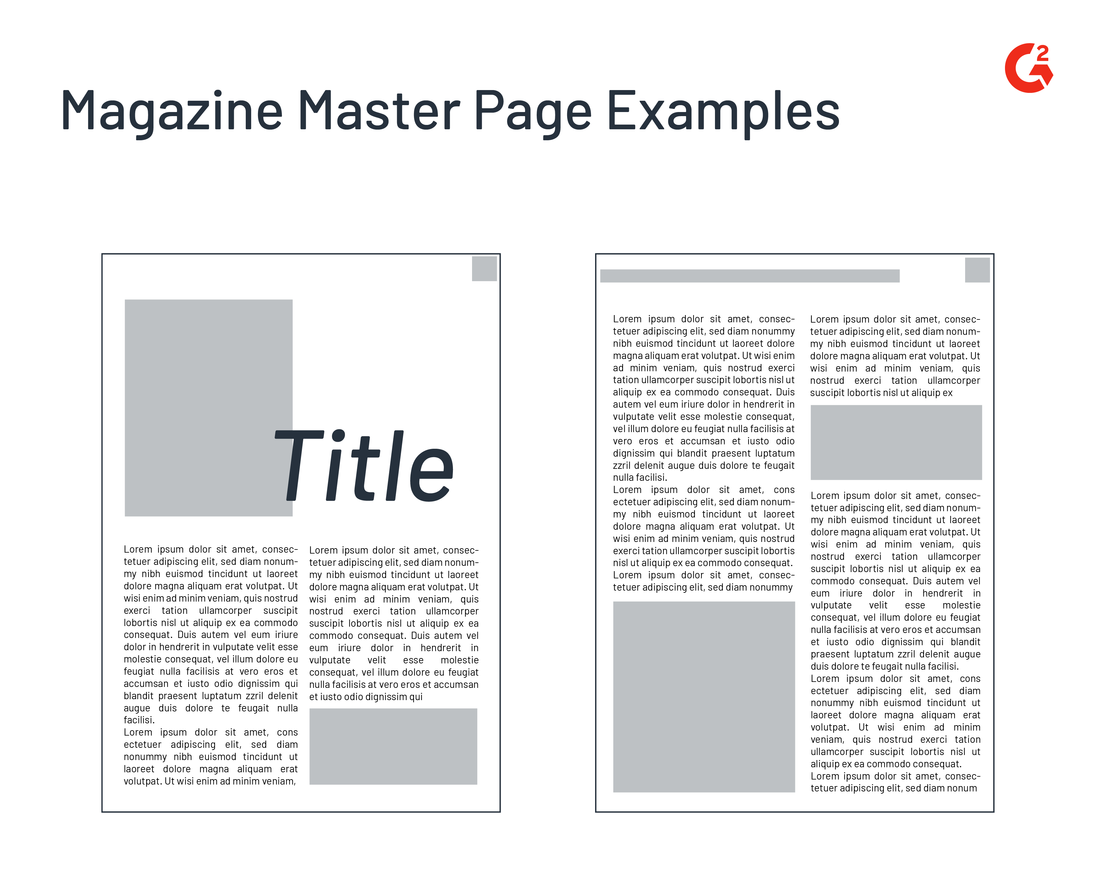
Every master page should include consistency to tie things together; whether that means using a unique typography for your page numbers or a singular border design, it is up to you and your team. Having these elements in place ensures that not only will your magazine look pretty, but there won’t be inconsistencies in the future with the size and space of elements.
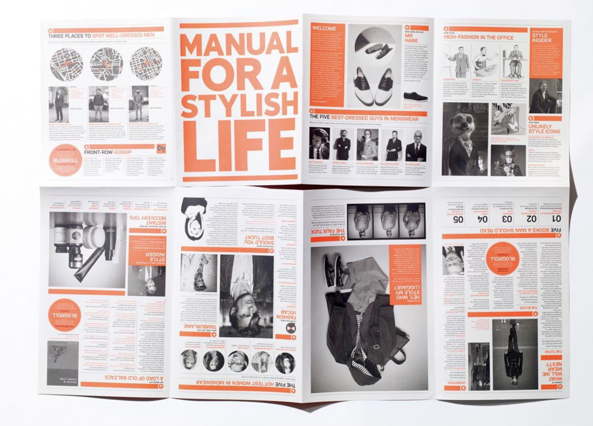
Tip 3: Conform to consistency
There’s nothing worse than inconsistency, especially in a magazine layout. If every magazine looks different, how can readers know they’re actually receiving issues from the same subscription? In your layout, be consistent with your dominant color scheme and typography (yes, this includes font pairing). This doesn’t mean that you can’t play around with these elements a little bit, but give your readers some lifeline.
Source: Pinterest
Tip: Speaking of typography and color contrast, it can’t hurt to get a good grasp on all of the basics of graphic design before plunging into a magazine layout.
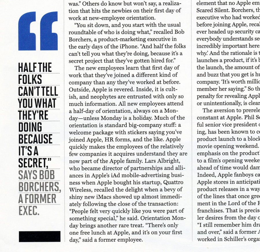
Tip 4: If it’s important, make it known
Articles that look long and boring (which they shouldn’t if you’ve got your layout skills in tow) can sometimes be passed over when the information within them is actually enticing.
Sometimes, writers come up with the perfect sentence that sums up a large point and is worded eloquently beyond belief. When you spot those special sentences, do readers a favor and pull them out.
Pull quotes are named that way because they’re pulled from the body of copy, but one could say that they’re also appropriately named because they pull the reader’s attention. Articles that look long and boring (which they shouldn’t if you’ve got your layout skills in tow) can be spiced up with their own words.
Source: Creative Pro
Tip 5: Align your body copy
The way we read goes according to visual hierarchy. Most languages, including the one you’re reading right now, are read from left to right. Hold this fact near and dear to your heart as you align all of that precious copy in your layout.
The most important thing to remember with your body copy is that the words themselves should be art. Don’t try too hard to design the text around an image – this could pull away from what the content is actually trying to say to the reader. Somebody spent their time writing their article; it would be a shame if their message were lost to an overdramatized design.
Reading a line in a magazine that feels never-ending will lose your reader’s attention; too short, and it’ll feel like
you’re
running
a
marathon.
I need an inhaler.
Tip: The optimal length of a line is 50-75 characters.
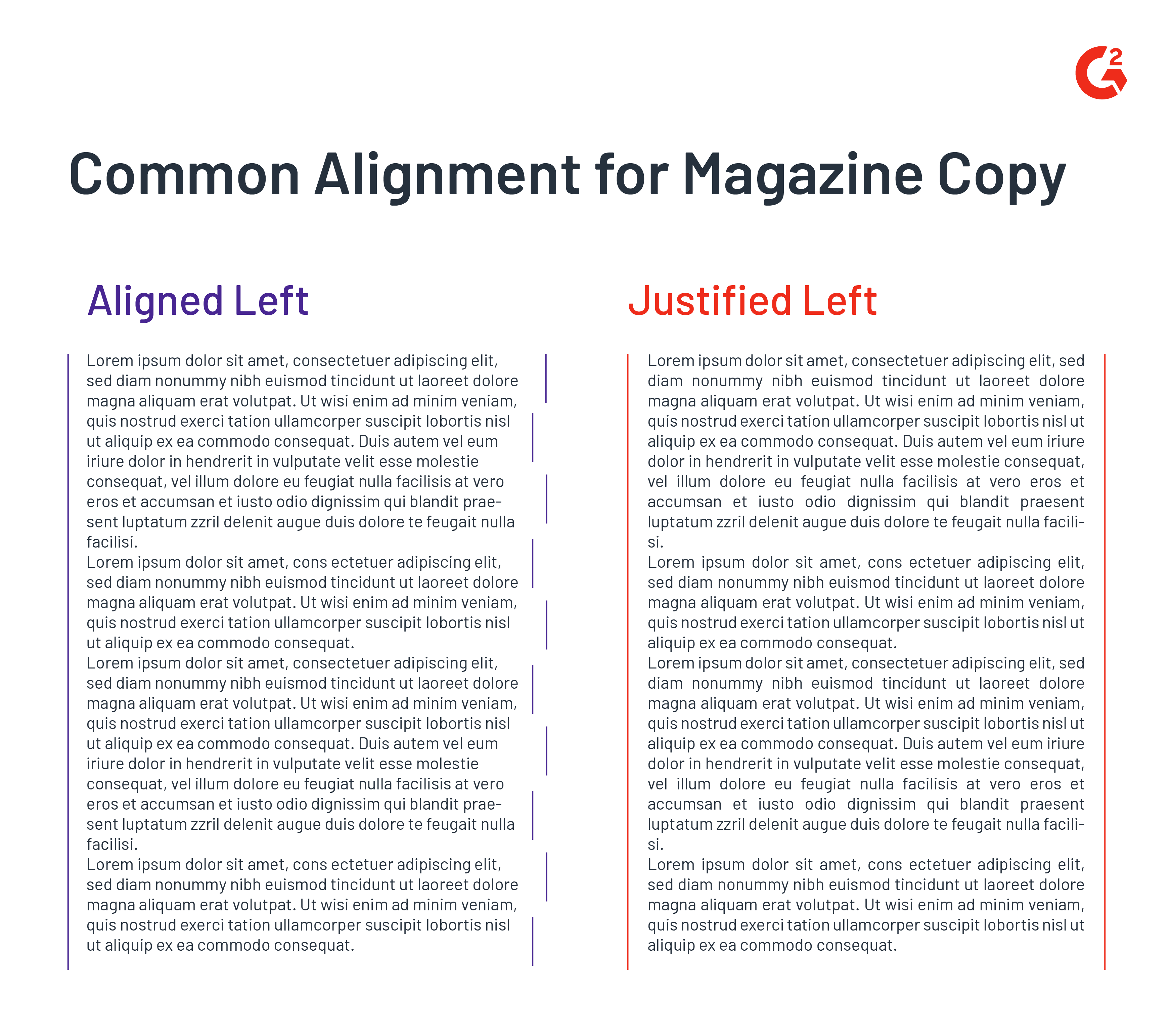
Bodies of copy are often either aligned to the left for easy readability or justified to make things look neat. Pick your poison.
Tip 6: Multimedia is a must
If your magazine is full of copy, don’t make your readers feel like they’re reading a book. Text that includes important data points can be pulled out and placed into an eye-catching infographic design. Paragraphs that beg for imagery should be accompanied by appealing photography. Even simple-looking illustrations can give your magazine a little character.
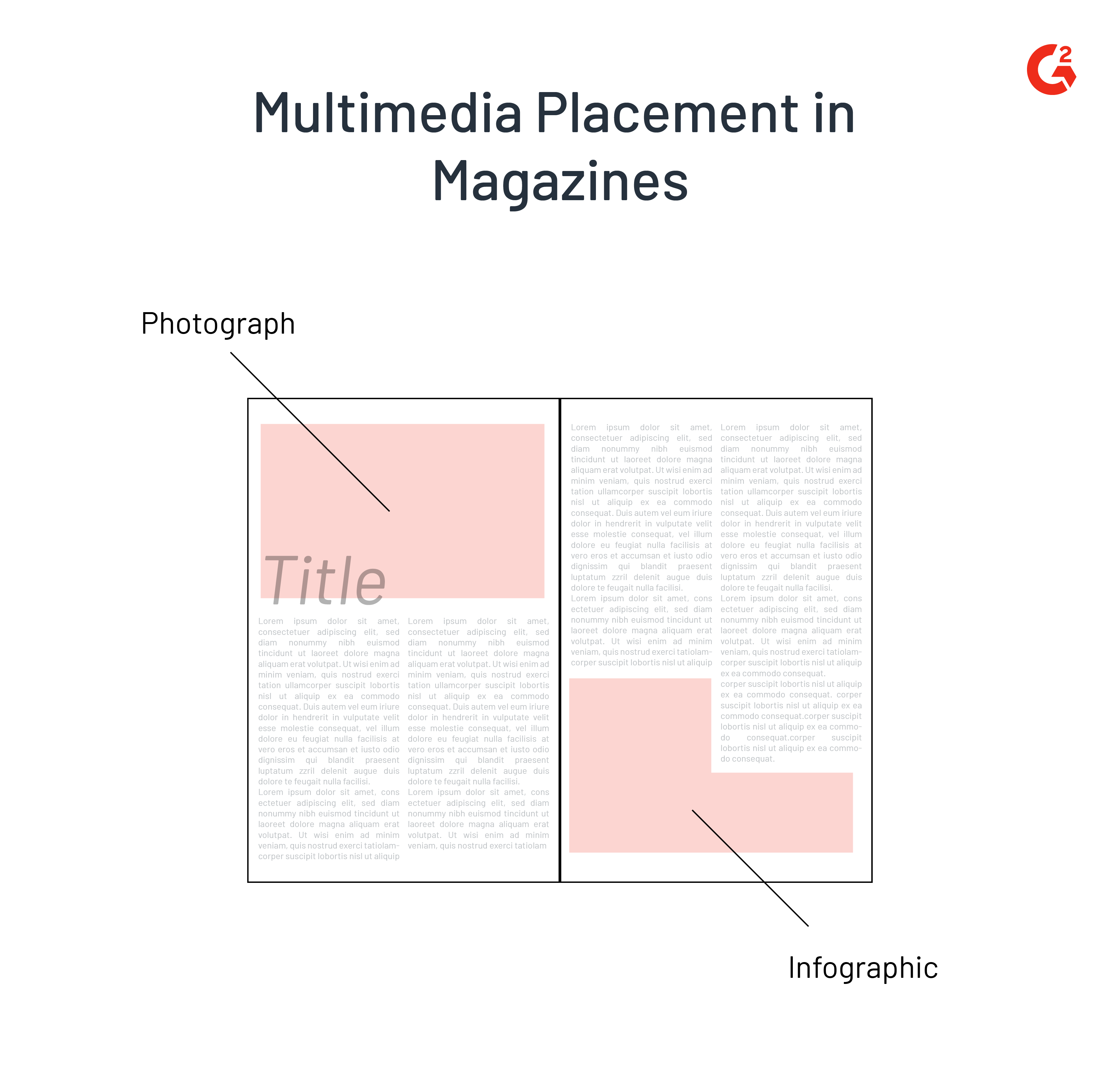
When laying out all of this content on a spread, don’t make the graphics and text fight one another; find the balance. Your infographic can take up the bottom half of a page while your copy fills the top. Illustrations don’t have to be at the forefront; design them to fit around the text and serve as a tasteful background.
Magazine layout maker tools
Magazine layout maker tools can greatly benefit professional designers and beginners. They offer a variety of features that can help you create stunning and engaging magazines, even if you don't have a lot of experience. Here are some of the most popular magazine layout-maker tools:
- Adobe InDesign is the industry standard for professional magazine layouts. It offers many features and capabilities. Although it can be a bit complex to learn, it's a versatile application that gives you pixel-perfect control over design and typography.
- Affinity Publisher is a more affordable alternative to InDesign. It offers many of the same features at a fraction of the cost, making it a great option for professional designers who are looking for a more cost-effective solution.
- Canva is a user-friendly online design platform. Canva offers a variety of magazine layout templates that you can customize with your own text, images, and logos. It's a great option for beginners or for creating simple magazines.
- Flipsnack is an online platform for creating digital magazines. It offers a variety of features that make it easy to create interactive and engaging publications. It's a great option for creating magazines you want to share online.
Master the art
The contents of your magazine issues don’t have to have a boring layout; nobody likes looking at that anyway. Take the time to make your publication one for the books with some outstanding imagery, peak organization, and optimal consistency so that readers keep coming back for more.
Looking to enhance your design skills? Discover the most sought-after design skills by employers.
This article was originally published in 2019. It has been updated with new information.
Daniella Alscher
Daniella Alscher is a Brand Designer for G2. When she's not reading or writing, she's spending time with her dog, watching a true crime documentary on Netflix, or trying to learn something completely new. (she/her/hers)

