What is a burndown chart?
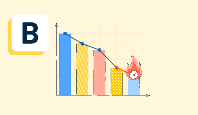
A burndown chart is a graphical depiction of how much work remains in a project and how much time a team needs to complete it. Agile teams use this chart to stay on track during work sprints, one-to-four-week periods.
Teams post the burndown chart in an accessible location and update it regularly. The vertical axis shows the number of remaining tasks, called user stories in agile, and the horizontal axis shows time. As a result, the line has a negative slope.
Agile software teams use product management software to create burndown charts and organize tasks. When other teams use the agile methodology, they typically use project management software instead.


Types of burndown charts
Burndown charts are popular in agile project management tools that teams use to track progress and spot problems. Two main types of burndown charts exist:
- The sprint burndown chart tracks the overall progress during a time-boxed sprint. It shows the team how much work remains in the sprint backlog, which contains all of the tasks necessary to meet the sprint goal.
- The product burndown chart gives a big-picture overview of the entire product or project progress over time. It tracks the amount of work remaining in the product backlog, which consists of every feature, user story, and task necessary to complete the project.
Basic elements of a burndown chart
A burndown looks like a typical line graph. All burndown charts share these features:
- Vertical axis. Also known as the Y-axis, this graph part shows the work left to do. Burndown charts record this in the number of tasks remaining or story points, estimating the effort needed to complete a user story or task.
- Horizontal axis. This axis shows time. Days are the most common unit of measurement here, but some charts use weeks instead.
- Actual work line. As the team records the work completed each day, a line begins forming on the graph. This line, also known as a burndown line, shows progress toward the team’s goal.
- Ideal work line. A straight diagonal line shows how much work the team needs to finish each day to stay on track for the project or sprint. The team compares their work line to this one to gauge their progress.
Benefits of a burndown chart
A burndown chart helps everyone get a clear big-picture view of a project or sprint in a project with many moving parts and contributors. Some specific benefits of using burndown charts include:
- Keeping the team on track. A burndown chart is an easy-to-understand visual representation that team members can quickly refer to see how the project’s going. If the project is falling short of deadlines, the team can talk about the obstacles standing in their way and adjustments that need to be made.
- Encouraging collaboration. A burndown chart highlights progress toward collective goals versus individual ones. This helps team members foster communication and collaboration among the group.
- Motivating team members. As the team progresses, the work line starts declining toward zero. Seeing quantitative proof of the effect of their hard work feels motivating and provides a sense of accomplishment.
Burndown chart best practices
A burndown chart helps teams manage their time more efficiently and improve communication about their goals. To make the most of the burndown chart as a tool, teams should keep the following best practices in mind:
- Make accurate estimates. A burndown chart relies on precise time estimations to create an ideal work line; otherwise, the team won’t have a solid baseline for comparing their actual work output. The team should create solid goals based on past velocity, the work they can deliver in a single sprint, and their current workload.
- Update and check the chart often. A burndown chart is only useful if it’s current. Depending on the scope of a project, a team may need to update the chart daily or weekly. Product and project managers should monitor the chart frequently and discuss it with team members.
- Analyze the chart. When looking at the chart, a project or product manager might notice trends, like flatlines. These patterns show that work production has leveled off or plateaued, which indicates an opportunity for improvement. In future sprints, the team can discuss avoiding similar roadblocks, such as technical issues or distractions.
Burndown chart vs. burnup chart
Burndown and burnup charts are two types of graphs that help agile teams graphically display their data.
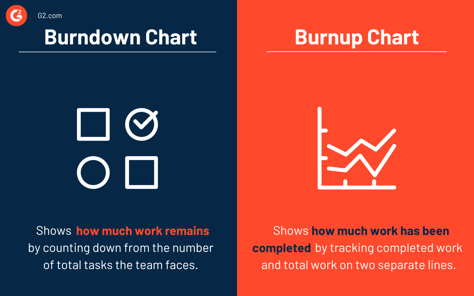
A burndown chart shows teams how much work remains. It counts down from the number of total tasks the team faces.
A burnup chart measures progress oppositely. It shows how much work the team has already completed. This results in a graph with a positive slope, pointing upward. Some teams prefer burnup charts because they clearly show scope changes. The chart tracks completed work and total work on two separate lines. If the horizontal total work line goes upward, it’s clear that the client added tasks to the project.
Need more data to guide your agile team? Learn about which key metrics to track.

Kelly Fiorini
Kelly Fiorini is a freelance writer for G2. After ten years as a teacher, Kelly now creates content for mostly B2B SaaS clients. In her free time, she’s usually reading, spilling coffee, walking her dogs, and trying to keep her plants alive. Kelly received her Bachelor of Arts in English from the University of Notre Dame and her Master of Arts in Teaching from the University of Louisville.


