


When asked about statistical analysis, people throw around words like numbers and research.
But those who work with datasets, analysis, Excel, and other statistical analysis software know it's so much more than that and very important.
Statistics is a branch of mathematics that comprises the collection, classification, analysis, interpretation, and presentation of numbers – specifically, data.
In other words, statistics is all about interpreting data, drawing conclusions from an extensive dataset, and presenting detailed predictions and measurements. Statistics further breaks down into descriptive and inferential statistics.
What is descriptive statistics?
Descriptive statistics is a methodology for describing data. It summarizes, organizes, and represents data from a vast raw database in a clear and managed manner. Combined with simple data visualizations, it forms the basis or starting point of every quantitative research and data analysis.
In this article, we’ll take a detailed look at descriptive statistics, understand its importance, learn through examples, and discuss its types and how they can be calculated using Excel.
Importance of descriptive statistics
Raw data is often fraught with errors and disorganization, making it difficult to interpret and analyze effectively. Deriving meaningful insights from such data can be nearly impossible without proper structure.
Descriptive statistics is vital in transforming complex information from large datasets into a more understandable format, enabling rapid insights. Descriptive statistics offers a clear overview of the data's characteristics and distribution by summarizing key measures such as mean, median, mode, range, and standard deviation.
This approach helps identify patterns, trends, and anomalies, making it easier to spot outliers and evaluate variability. Such initial analysis lays the groundwork for more advanced statistical methods, empowering analysts and decision-makers to better understand the dataset.
Moreover, descriptive statistics enhance data visualization, allowing data scientists and business analysts to create intuitive charts, graphs, and dashboards that present findings clearly and effectively. By converting numerical data into visual representations, stakeholders can quickly comprehend key insights and confidently make informed decisions.
Why use descriptive statistics
While there are many methods for analyzing data, descriptive statistics helps you summarize and interpret information quickly. Focusing on key features like averages and variations allows you to spot patterns and trends more easily. This clarity helps you make better decisions and communicate your findings effectively, even to those without a strong background in statistics.
Vous voulez en savoir plus sur Logiciel d'analyse statistique ? Découvrez les produits Analyse statistique.
Descriptive statistics examples
While describing, summarizing, and representing a large set of observations, you risk distorting the original data or losing important details. Sometimes, you need more than one data collection point and summarizing indicator.
In such cases, descriptive statistics helps simplify large amounts of data into a more straightforward summary, usually by providing over one indicator in a manageable form.
For example, consider a set of 500 students. We may be interested in observing their overall performance. Our descriptive data collection points include attendance, class performance, and grades.
The grade point average (GPA) usually averages all these data points to better understand a student's overall academic performance. Descriptive statistics help summarize data meaningfully, allowing us to find patterns that emerge from it. So, the GPA is an excellent example of descriptive statistics.
Descriptive statistics vs. inferential statistics
After collecting data in quantitative research, we need to understand and describe the nature and relationship of the data collected as the first step: descriptive statistics.
The next step is to compare your findings with the hypothesis, confirm or dispute it, and check if it can be generalized to a larger population: inferential statistics.
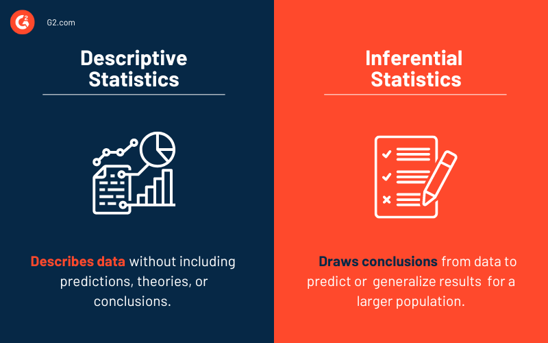
The first step mentioned is descriptive statistics. As the name suggests, it describes the data without including predictions, theories, or conclusions. Descriptive statistics does not involve any generalization or inference beyond what is immediately available – it simply explains what is or what the data shows.
The second step is called inferential statistics, which helps you reach conclusions beyond the available data. To make inferences from our data collected to a more general condition, we use inferential and descriptive statistics to describe what our data entails.
When to use descriptive statistics?
You should use descriptive statistics when you want to:
- Summarize data: Provide a clear overview of the main characteristics of your dataset.
- Explore trends: Identify patterns, trends, or outliers within the data.
- Communicate findings: Present information to stakeholders in an easily digestible format using visuals and simple metrics.
- Understand your sample: Analyze and interpret data from a specific group without trying to make predictions about a larger population.
Types of descriptive statistics
Descriptive statistics allows you to summarize, characterize, and describe your data based on its properties. There are many methods to do this. You'll find two classifications to descriptive statistics in some pieces, and in some, you'll read about three.
People can describe data in different ways. Below, we've classified descriptive statistics into four major types.
Measures of central tendency
A measure of central tendency also called the measure of a central location, is a single value that describes a dataset by identifying its central position.
There are three measures of central tendency: mean, median, and mode. Under different conditions, some measures of central tendency are more appropriate than others.
Mean
The mean, also known as the average, is calculated simply by adding all the values in the dataset and dividing it by the total number of values within the dataset.
Mean formula:
Mean = Sum of all values/Total number of values
Here's a mean example that will help you understand this better:
Consider the following data set with six numbers: 2, 6, 18, 4, 26, 4.
To find the mean or average of these numbers, we add up all the values and divide the sum by the total number of values.
Mean = (2+6+18+4+26+4)/6 = 60
Median
The median is the middle point for a dataset arranged in order of magnitude (ascending or descending order). It is the figure separating the higher figures from the lower figures within a data set.
Median formula
- Median (Even Values) = Mean of middle numbers
- Median (Odd Values) = Middle number
Let's use the same dataset as used above to understand the median with an example.
First, we must arrange the values in ascending or descending order to find the median.
Rearranged values: 2, 4, 4, 6, 18, 26.
Then, we identify the number in the middle as the median. If there are even numbers of values, we calculate the mean of the values in the middle to find the median.
Median = (4+6)/2 = 10/2 = 5
Mode
The mode of a data set is the value appearing most often in the set.
Mode formula
Mode = Most occurring value
Let’s consider the dataset above to understand a mode example. To find the mode, we need to find the most frequent response.
In the scenario above, 4 appears twice in the dataset. Hence, the mode = 4.
Measures of variability
Variability helps us understand how far apart each data point is from the other and its distance from the center of a distribution. It is also referred to as spread, scatter, or dispersion. It is most commonly measured with variance, standard deviation, range, and interquartile range.
Variance
Variance helps you comprehend the extent of spread in your data set. It is calculated by taking an average of squared deviations from the mean. The more spaced out your data is, the more significant the variance.
Variance formula
If there are n values in total, x1, x2, x3,…,xn are the given values, and x̄ is their mean.
Variance = [(x1-x̄)^2+ (x2-x̄)^2+ (x3-x̄)^2+…….+(xn-x̄)2]/n
Let's use a variance example to understand this better. Consider a small dataset: 5, 13, 4, 72.
The first step is calculating the mean of the data.
Mean = 23.5
The next step is to subtract the mean from each data value. The result indicates the value's deviation from the mean.
5 - 23.5 = -18.5
13 - 23.5 = -10.5
4 - 23.5 = -19.5
72 - 23.5 = 48.5
The resulting values are squared and summed to give the following results:
342.25 + 110.25 + 380.25 + 2,352.25 = 3,185
The sum of these values is then divided by (total number of values - 1) to give the variance.
Variance = 3185/(4-1) = 1061.67
Standard deviation
The representation of the distance of each value from the mean is called standard deviation.
A higher value indicates a more considerable distance, while a lower one suggests that the value is closer to the center (mean).
The square root of the variance is the standard deviation.
Standard deviation formula
Standard Deviation = √variance
Considering the value in the variance example above, we'll understand a standard deviation example.
SD = √1061.67 = 32.58
Range
The range is the spread of the dataset, starting from the lowest value to the highest in the distribution.
The range indicates the degree of variability. A more significant value indicates high variability, while a subordinate one indicates low variability.
Range formula
Range = Highest value - lowest value
Let us take an example to understand this easily. Consider a dataset with the following values: 105, 24, 2, 45, 75, 204, 41, 71, 47, 33, 21, 67.
We deduct the smallest value from the largest value in the data set to calculate the range.
Range = 204 - 2 = 202
Interquartile range
A quartile describes the division of a set of observations into four intervals. The interquartile range represents the variability between the second and third quartiles, unlike the range that does the same for the entire dataset.
We’ll use the same dataset as above as an example. To find the interquartile range, we first need to arrange our values in ascending or descending order.
Interquartile range formula
Interquartile range = Quartile3 – Quartile1
Ascending order: 2, 21, 24, 33, 41, 45, 47, 67, 71, 75, 105, 204
The next step is to find the values in Q1 and Q3. To do this, we multiply the total number of values in the data set by 0.25 for Q1 and 0.75 for Q3.
Q1 position: 0.25 x 12 = 3
Q3 position: 0.75 x 12 = 9
Q1 is the value in the 3rd position, which is 24
Q3 is the value in the 9th position, which is 71
Interquartile range = 71 - 24 = 47
Distribution shape
The best way to represent your data is by using charts and graphs. There are so many options, so the one you choose depends on what kind of data you have and what you want to display.
If you want to display a relationship between data, you can use a bar graph. You will need to use a pie chart to represent how various categories are proportioned in your dataset. Line charts and scatter plots are good ways to display data points.
When we graph a data set, each point is arranged to produce a distribution shape. On observing it, you can identify the spread of data, where the mean lies, the range of the data, and more.
The shape of the distribution can help us identify other descriptive statistics, such as central tendency, skewness, and kurtosis.
Central limit theory
The central limit theorem is an often-used statistical theory stating that the distribution of averages becomes more normal, narrower, and centralized as the sample size increases.
The theory is widely used in finance to analyze an extensive collection of funds and estimate portfolio distributions and traits for returns and risk.
Skewness
The asymmetry of a distribution is measured by skewness.
Types of skewness
A distribution can represent positive (right), negative (left), or zero skewness.
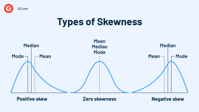
- Zero skewness: Any symmetrical distribution - normal, uniform, and other distributions – has zero skews.
- Positive skewness: A right-skewed distribution, or positive skew, has a long tail that inclines toward the right side. This happens when most of the graph's data is on the left side, and the mean exceeds the median.
- Negative skewness: A left-skewed distribution, or negative skew, has a long tail that inclines towards the right side. This happens when most of the graph's data is on the right side, and the mean is less than the median.
Kurtosis
Kurtosis is a measure of statistics describing the density of distribution tails or extreme values in a data representation. A positive value indicates the presence of a lot of data, while a negative value indicates less data in the distribution tails.
Outliers are extreme values that differ from the data points in a dataset. The presence or occurrence of an outlier can have a significant impact on statistical analyses. Kurtosis simply indicates outliers or how often they occur in a dataset.
To understand this, we take a simple example: Kurtosis in finance measures the intensity of risk. The more kurtosis there is, the higher the probability of risk.
Types of kurtosis
A set of data can display three categories of kurtosis: platykurtic, mesokurtic, and leptokurtic. All these are measured in comparison to the standard normal distribution.
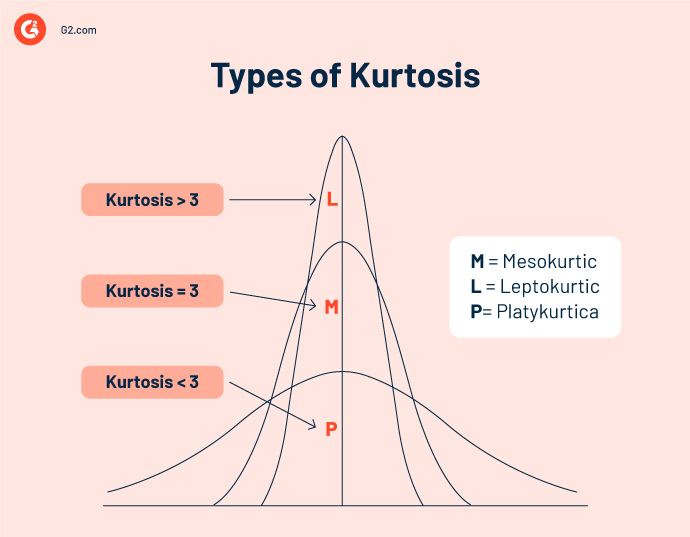
- Platykurtic or negative kurtosis: Signifies thin-tailed distributions. Since the density of the tail indicates how frequently an outlier will occur. In this case, their occurrence is infrequent. Kurtosis is lesser than the measure of normal distribution (Kurtosis < 3).
- Mesokurtic kurtosis: Represents not-so-heavily tailed distributions that indicate that an outlier may occur frequently. Kurtosis equals the measure of normal distribution (Kurtosis = 3).
- Leptokurtic or positive kurtosis: Describes very heavily tailed distributions that indicate the occurrence of very frequent outliers. Kurtosis is greater than the measure of normal distribution (Kurtosis > 3).
Frequency distribution
A frequency distribution represents the pattern of the number of times a variable occurs in a dataset (frequency of a variable). It is depicted using graphs and frequency tables.
A frequency distribution depicts the total number of observations within a particular interval. It is widely used in trading and finance to identify and predict trends.
Four types of frequency distributions can be applied to different types of variables and represented through frequency distribution tables.
For example, evaluating the number of rooms per household in a neighborhood with 10 houses, we retrieve the following data: 1, 1, 3, 2, 2, 4, 2, 1, 1, 3, 5.
Ungrouped frequency distributions
Ungrouped frequency distributions indicate the number of observations of each individual data value instead of a group of data values. Simply put, it helps us easily identify how often a variable occurs in a dataset.
Ungrouped frequency distribution table
| No. of rooms | Frequency |
| 1 | 4 |
| 2 | 3 |
| 3 | 2 |
| 4 | 1 |
| 5 | 1 |
Grouped frequency distributions
Grouped frequency distributions indicate the number of observations in each class interval (ordered group of variable values).
Grouped frequency distribution table
| No of rooms | Frequency |
| 1-2 | 7 |
| 2-3 | 5 |
| 4-5 | 2 |
Relative frequency distributions
Relative frequency distributions exhibit the percentage of observations falling in each range of values or class intervals. We must add each value to the next until we reach the last value.
Relative frequency distribution table
| No. of rooms | Frequency | Relative Frequency |
| 1 | 4 | 4/11 = 0.36 |
| 2 | 3 | 3/11 = 0.27 |
| 3 | 2 | 2/11 = 0.18 |
| 4 | 1 | 1/11 = 0.09 |
| 5 | 1 | 1/11 = 0.09 |
| Total = 11 |
Cumulative frequency distributions
Cumulative frequency distributions exhibit the total frequencies of a variable in each range of values or class intervals. It indicates the percentage of the total number of observations to which each category belongs.
Cumulative frequency distribution tables
| No. of rooms | Frequency | Cumulative Frequency | Cumulative Relative Frequency |
| 1 | 4 | 4 | 4/11 = 0.36 |
| 2 | 3 | 4+3 = 7 | 7/11 = 0.63 |
| 3 | 2 | 7+2 = 9 | 9/11 = 0.81 |
| 4 | 1 | 9+1 = 10 | 10/11 = 0.81 |
| 5 | 1 | 10+1 = 11 | 11/11 = 1.00 |
| Total = 11 |
How to calculate descriptive statistics in Excel in 3 simple steps
Let's say we have a dataset with 10 values entered into a single column on a Microsoft Excel spreadsheet.

Step 1: Click on the 'Data' tab. Select 'Data Analysis’ in the Analysis group.

Step 2: Click on 'Descriptive Statistics'. You will find this in the pop-up Data Analysis window.

Step 3: Enter the details in the dialogue box
- Input the data range into the 'Input Range' text box
- Check the 'Labels in first-row’ check box (only do this if you have titled your data in the first row)
- Type a cell location into the 'Output Range' box
- Click on the 'Summary Statistics' check box and click 'OK'

The descriptive statistics will be returned in the column you selected as the output range.

Statistical analysis software
While gaining access to data presents unlimited opportunities, it's not enough. How can you turn it into insights that help you accelerate growth?
Employing statistical analysis software that uses the latest techniques is the best way to analyze any kind and size of data. Your choice depends on your requirements and what you want to do with your data.
There are many factors to consider when choosing the correct statistics software, but to be included in this category, the software must:
- Provide everything you need for data manipulation
- Use validated statistical methods to give reliable results
- Facilitate easy data understanding through charts and graphs
*Below are the top 5 leading statistical analysis software solutions from G2’s Fall 2024 Grid® Report. Some reviews may be edited for clarity.
1. IBM SPSS Statistics
IBM SPSS Statistics is a prompt and robust statistical software suite developed by IBM that drives data management and advanced analytics in numerous industries. It has a powerful market presence among statistical analysis products.
What users like best:
"Quick and easy to learn. It can handle large amounts of data and has a great user interface. The drag-and-drop UI for statistical analysis is very helpful for beginners. It covers all kinds of basic statistical analyses. It is a very useful and preferred option for any student/beginner. The Excel-like user interface also makes it easier for data entry."
- IBM SPSS Statistics Review, Sajal Kanti Ghosh
What users dislike:
"SPSS has some limitations concerning more advanced statistical modeling. Alternatives like R, SAS, or MATLAB, are better for these analyses but come with a substantially steeper learning curve. Editing output and creating graphs and charts is not intuitive in SPSS. I typically take my output to Excel to create figures and tables."
- IBM SPSS Statistics Review, Evan S.
2. JMP
JMP is a data analysis software that combines the strength of interactive visualization with powerful statistics. It allows you to access, clean, visualize, share, and communicate results. JMP uses cutting-edge and modern statistical methods to stay dedicated to providing a graph for every statistic and vice versa.
What users like best:
"This software is easy to use and really helpful in analyzing complex data. Drawing inferences from the data has never been this easy. The 'help' section assists you in figuring out what analysis you may need to use for your data."
- JMP Review, Himanshu P.
What users dislike:
"The price point. It is billed annually, that might not be very budget friendly for independent users. There is other software that comes at a cheaper price. But if you are looking to invest that extra money, you do get tons of advantages with it. JMP analysis is easy to transfer to MS Word or PowerPoint to make a presentation. This feature puts it on par with other competitor software."
- JMP Review, Rishi R.
3. Minitab Statistical Software
Minitab Statistical Software is a data and statistical analysis tool used to help businesses understand their data and make better decisions. It empowers visualizations, statistical analysis, and predictive and improvement analytics to enable data-driven decision-making.
What users like best:
"I liked the package because it was a professional use package (not just designed for classroom use), and it was still easy enough for my students to use. There is a small learning curve to overcome, but my students adapted to the package very quickly. The iterations I have used started with version 12, and I am now using version 17.
The product has become more streamlined over the years and more user-friendly, as well. The support I have received from Minitab has been excellent, and utilizing the license server for my lab allows me to deploy the package to more computers."
- Minitab Statistical Software Review, Adejoh Y.
What users dislike:
"Despite an excellent built-in help and learning functionality, you really should have a good foundational knowledge of statistics to begin with. I frequently see people use Minitab to analyze their data without really understanding what the results are showing them."
- Minitab Statistical Software Review, Mikey J.
4. QI Macros SPC
QI Macros SPC is a user-friendly Excel add-in that simplifies statistical process control and Six Sigma analysis. It offers a wide range of features, including control charts, statistical tests, and Six Sigma tools, making it a valuable asset for professionals in various industries.
What users like best:
"The detailed insights offered by QI Macros enable data-driven decision-making. Its capacity to swiftly identify trends, outliers, and areas for improvement has been instrumental in optimizing our processes and enhancing overall quality."
- QI Macros SPC Review, Jael T.
What users dislike:
"Non-subscribed users have limited access compared to paid subscribers, which creates a strong incentive to purchase the product. While this approach encourages sales, it remains competitive within the market."
- QI Macros SPC Review, Mithin M.
5. OriginPro
OriginPro is a powerful scientific data analysis and graphing software developed by OriginLab. It's widely used in fields like research, engineering, and education due to its robust features and user-friendly interface.
What users like best:
"I have used Origin extensively for over 10 years, and it excels in data organization, visualization, and analysis. We utilize it to create figures and analyze imaging and electrophysiology data. Its powerful graphing tools enable the production of publication-quality figures, while its robust curve-fitting capabilities enhance our analytical precision."
- OriginPro Review, Moritz A.
What users dislike:
"OriginPro lacks Excel integration, meaning that any changes to the original data must be manually updated in the OriginPro spreadsheet. This can lead to additional time and effort when maintaining data accuracy."
- OriginPro Review, Arunmozhi B.

New approaches to handling big data
Today, gathering data to help you better understand what is working for you and what is not is relatively easy. This data can help you discover more about your target audience, customers, their requirements, operations, marketing trends, and other information that can help you accelerate growth.
But just having this data is not enough. It's essential to clean, transfer, and understand what your information is trying to tell you. These days, collecting data might be fine, but handling it can get messy since the datasets are enormous and complex.
The best way to gain valuable insights is to use statistical analysis software. But before that, it’s good to have a brief understanding of the various methods of statistical analyses so you can make the most of the tools you will be using.
Ready to learn more about how you can make the most of your data? Learn more about statistical analysis.
This article was originally published in 2022. It has been updated with new information. robust

Devyani Mehta
Devyani Mehta is a content marketing specialist at G2. She has worked with several SaaS startups in India, which has helped her gain diverse industry experience. At G2, she shares her insights on complex cybersecurity concepts like web application firewalls, RASP, and SSPM. Outside work, she enjoys traveling, cafe hopping, and volunteering in the education sector. Connect with her on LinkedIn.

