


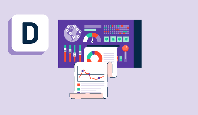
¿Qué es un panel de control?
Los paneles de control, especialmente aquellos con datos en tiempo real, son una característica central de las plataformas de análisis. Incluso los productos de software de visualización de datos menos completos a menudo incluyen paneles de control con los que los usuarios pueden interactuar para explorar datos empresariales. Los usuarios pueden programar su software de análisis para mostrar métricas de su elección y crear múltiples paneles de control que muestren análisis relacionados con equipos o iniciativas específicas. Desde análisis predictivos del tráfico web hasta tasas de conversión de clientes durante un período de tiempo especificado, los usuarios pueden elegir sus métricas preferidas para presentar en los paneles de control y crear tantos paneles como sea necesario.
Los administradores pueden ajustar los permisos de diferentes paneles de control para que sean accesibles a los usuarios de la empresa que más los necesiten. Los usuarios pueden optar por compartir ciertos paneles de control en monitores de oficina o tomar capturas de pantalla de los paneles para guardarlas y compartirlas según sea necesario. Algunos productos de plataformas de análisis pueden permitir a los usuarios explorar paneles de control en sus dispositivos móviles.
Las empresas pueden crear paneles de control para mostrar datos de una amplia gama de unidades de negocio y fuentes de datos utilizando software de paneles de control. Por ejemplo, los datos financieros, de recursos humanos y de la cadena de suministro pueden ser servidos en un panel de control. Estos datos pueden ser vistos por separado o combinados para encontrar tendencias y patrones.
Los paneles de control difieren en términos de la capacidad del usuario para profundizar y explorar los datos disponibles. Algunas herramientas más avanzadas permiten al usuario explorar los datos, incluso proporcionando herramientas para 'hablar' con los datos y hacer preguntas en lenguaje natural. Con herramientas menos robustas, los usuarios aún pueden obtener respuestas a sus preguntas de datos filtrando los datos o utilizando lenguajes de consulta, como SQL.
Otras herramientas con capacidades analíticas a menudo también incluyen paneles de control, como software de análisis de marketing, software de análisis de ventas y software de análisis de productos.


Tipos de paneles de control
Dependiendo de para qué se use un panel de control o la industria en la que se encuentre una empresa, hay tres tipos diferentes:
- Operacional: Estos tipos de paneles de control proporcionan datos en tiempo real. Por ejemplo, los equipos financieros pueden usar estos paneles para comprender mejor sus ganancias y pérdidas, los equipos de recursos humanos pueden seguir el flujo de incorporación y salida de personal, y los equipos de marketing pueden obtener una vista panorámica de sus campañas.
- Estratégico: Los paneles de control pueden presentar datos históricos y actuales y predecir datos futuros utilizando análisis predictivos. Si una empresa quiere tener una idea de cómo sus datos actuales y su rendimiento se comparan con sus datos históricos, pueden utilizar paneles de control estratégicos para obtener una comprensión más profunda de dónde se encuentran en comparación con sus métricas predefinidas e indicadores clave de rendimiento (KPIs). Estos paneles pueden ayudar a los ejecutivos a tener una idea del rendimiento general del negocio. Estos pueden desglosarse por diferentes unidades de tiempo, como mes, trimestre o año.
- Analítico: Los paneles de control son particularmente útiles cuando hay una gran cantidad de datos para analizar. Los paneles de control analíticos pueden ayudar a los usuarios empresariales a predecir resultados y descubrir ideas. Aunque las versiones anteriores de este software requerían una asistencia significativa del departamento de TI, muchas opciones de autoservicio permiten a los usuarios típicos con poca o ninguna experiencia en datos crear y manipular paneles de control.
Beneficios de usar un panel de control
Cuando se usan correctamente, los paneles de control pueden llevar a muchos beneficios. Algunos de estos beneficios incluyen:
- Mejorar procesos: Sin un panel de control en su lugar para ser utilizado en toda una empresa, los procesos pueden ser lentos e ineficientes ya que las partes interesadas buscan datos de fuentes dispares y solicitan datos de varias personas. Los paneles de control pueden ayudar a un usuario empresarial a acceder fácilmente a datos y análisis de datos y compartirlos con partes interesadas internas y externas.
- Consolidar datos: En esta era impulsada por los datos, esencialmente cada programa y dispositivo que tiene una empresa produce una gran cantidad de datos. Para entender estos datos diversos de la mejor manera posible, a menudo es necesario combinarlos mediante métodos como la mezcla de datos, que permite a los usuarios combinar datos de múltiples fuentes en un conjunto de datos funcional.
- Mejorar la productividad: Los días de clasificar entre decenas, si no cientos, de sistemas y necesitar un inmenso apoyo de TI han pasado. Con los paneles de control (especialmente aquellos que son de naturaleza de autoservicio con características como la búsqueda en lenguaje natural), cualquiera que busque datos y análisis de datos, incluidos los usuarios empresariales promedio, puede obtener ideas de sus datos.
- Identificar tendencias: Los paneles de control permiten a los usuarios identificar rápida y fácilmente tendencias en las métricas empresariales. Si ciertas métricas no están en camino de alcanzar los objetivos de fin de mes, fin de trimestre o fin de año, las empresas pueden ver eso de inmediato con herramientas de visualización de datos. Basándose en cómo están funcionando los KPIs, las empresas pueden ajustar sus estrategias y métodos para alcanzar los objetivos. Poder reaccionar a los datos es una estrategia general importante para una mayor modernización empresarial y transformación digital.
Impactos de usar un panel de control
Configurar e implementar paneles de control es relativamente sencillo en comparación con implementar otras herramientas y tecnologías de inteligencia empresarial. Puede requerir algún conocimiento de desarrollo para conectar el producto a una base de datos o aplicación de terceros. Sin embargo, si un no desarrollador está interesado en construir una visualización usando una hoja de cálculo, la implementación es básica y los beneficios son numerosos.
El resultado final de una empresa podría verse positivamente impactado al usar un panel de control:
- Aumento de la visibilidad: Cuando las métricas y los KPIs se rastrean adecuadamente, el equipo financiero de una empresa tiene una mejor comprensión de su situación financiera y puede planificar en consecuencia.
- Mejora de la comunicación: Entender los datos empresariales es solo la primera etapa del proceso. A continuación, los usuarios y las unidades de negocio deben comunicarse en torno a los datos y tomar decisiones basadas en datos en función de esos datos. Por ejemplo, los líderes empresariales pueden examinar un panel de control de la situación financiera de una inversión potencial y usar esa información para comenzar una conversación sobre la conveniencia de invertir en dicho negocio.
- Introducción de una cultura basada en datos: Si las empresas se aseguran de que los datos estén en el centro de su negocio, pueden comenzar a tomar decisiones que se basen en principios firmes y sean iterables. En una cultura así, las conjeturas y las opiniones caprichosas son cosa del pasado.
Elementos básicos de un panel de control
El formato de un panel de control en una plataforma de análisis puede variar, pero un panel de control completo incluirá los siguientes elementos, proporcionando al usuario la capacidad de segmentar y combinar puntos de datos de varias maneras:
- Gráfico de barras: Los gráficos de barras (que vienen en tipos horizontales y verticales) permiten a los usuarios segmentar datos por categorías. Por ejemplo, un usuario puede trazar el número de ventas cerradas en un trimestre particular, dividido por región. Estos también pueden venir como gráficos de barras apiladas, que permiten comparaciones entre entidades completas, mientras se visualizan sus partes constituyentes. Así, si una agencia quisiera comparar sus gastos en diferentes períodos de tiempo y también analizar en qué se gastó ese dinero (reclutamiento, gastos de oficina, etc.), un gráfico de barras apiladas podría ser una buena opción.
- Gráfico circular: Aunque es muy fácil que los gráficos circulares se vuelvan desordenados e ilegibles, pueden ser útiles para comparar porcentajes de un todo. Por ejemplo, si una empresa quisiera entender qué porcentaje de sus clientes eran pequeñas empresas, podrían visualizar esto fácilmente usando un gráfico circular.
- Vista de KPI único: Una vista de KPI único puede ser tan simple como ver un solo número en la pantalla, comparándolo con un objetivo predeterminado. Por ejemplo, el panel de control puede mostrar el gasto real en marketing en comparación con el objetivo.
- Gráfico de líneas: Estos gráficos muestran valores de datos continuos a lo largo del tiempo. Esto podría ser útil para visualizar el número de ventas realizadas en un trimestre para determinar qué trimestre fue el más próspero.
- Gráfico de tendencias: Un gráfico de tendencias, que puede visualizarse como un gráfico de líneas, gráfico de barras o columna, puede ser útil para mostrar cuándo un valor está por encima o por debajo de un objetivo. Por ejemplo, esto puede usarse para mostrar cómo un reclutador superó o no alcanzó sus objetivos.
Mejores prácticas para paneles de control
Para que un panel de control funcione, las empresas deben seguir estas mejores prácticas:
- Comienza pequeño: Especialmente cuando las empresas tienen una gran cantidad de datos, el número de paneles de control puede acumularse rápidamente. Esto, a su vez, puede llevar a una sobrecarga cognitiva y una incapacidad para dar sentido a las diversas vistas y filtros multifacéticos. Por lo tanto, es aconsejable comenzar despacio y pequeño, asegurándose de que los puntos de datos y los conjuntos de datos se entiendan bien antes de agregar más.
- No empieces desde cero: Ayuda preguntar qué paneles de control ya se han construido, ya que no hay necesidad de reinventar la rueda. Reutilizar paneles de control preexistentes permite obtener información más rápido y comenzar a colaborar en torno a los datos.
- Pide ayuda: Los equipos de TI o de datos manejan, manipulan e integran datos a diario. Obtener ayuda de ellos con ambigüedades en torno a los paneles de control, filtros u otros mecanismos es aconsejable.
Paneles de control vs. informes
Aunque la mayoría de las plataformas de análisis proporcionarán la capacidad de crear paneles de control e informes, hay diferencias entre los dos. Un informe es una recopilación detallada de inteligencia, que a menudo puede incluir datos de paneles de control. Estos informes frecuentemente recopilan y compilan varios paneles de control para contar una historia completa sobre los datos empresariales.
Los paneles de control, sin embargo, son una vista única de los datos, aunque pueden incluir múltiples formas de visualización. A diferencia de un informe, los paneles de control no incluyen texto detallado y descripciones.

Matthew Miller
Matthew Miller is a former research and data enthusiast with a knack for understanding and conveying market trends effectively. With experience in journalism, education, and AI, he has honed his skills in various industries. Currently a Senior Research Analyst at G2, Matthew focuses on AI, automation, and analytics, providing insights and conducting research for vendors in these fields. He has a strong background in linguistics, having worked as a Hebrew and Yiddish Translator and an Expert Hebrew Linguist, and has co-founded VAICE, a non-profit voice tech consultancy firm.


