


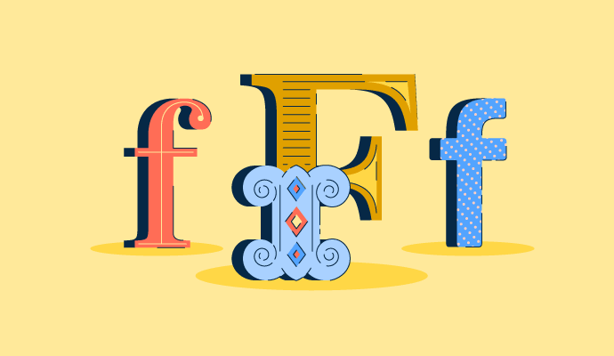
¿Cuál es la diferencia entre un tipo de letra y una fuente?
Aquí no hay un remate.
Hay una abundancia de palabras que los diseñadores gráficos usan mientras hablan sobre tipografía, y todas son bastante confusas; es un idioma completamente extranjero para cualquiera fuera de su mundo.
Antes de comenzar, probablemente deberíamos obtener una buena comprensión de lo que significa tipografía.
La tipografía es la apariencia general del texto. Esto significa no solo la fuente, sino también la altura, el peso, el color, la orientación y el tamaño de los caracteres.
¿Confundido? Sigue leyendo.
Términos de tipografía que debes conocer
- Caracteres
- Tipos de estilo de fuente
- Alineación de texto
- Espaciado tipográfico
- Anatomía del tipo
- Unidades de medida en tipografía
Ahora que hemos aclarado eso, podemos entrar en un poco más de detalle.
Si eres un tipógrafo, no hay excusa para no conocer los siguientes términos. Si simplemente estás interesado en aprender más sobre diseño gráfico, bienvenido a la clase de vocabulario de tipografía. Y, si ya estás familiarizado con todo esto y estás buscando una herramienta para crear documentos de alta calidad, consulta el software de autoedición.
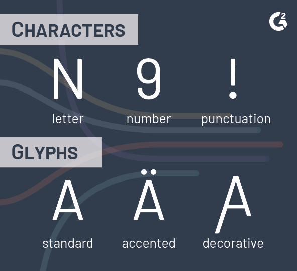
1. Caracteres
Son solo símbolos. ¿Cuánto podría haber en ello? Bueno, sigue leyendo para verlo por ti mismo.
Carácter
Comenzando con el carácter, que es un símbolo individual que toma la forma de una letra, número o signo de puntuación.
Tipo de letra vs. fuente
Estos dos términos a menudo se confunden, pero hay una diferencia entre un tipo de letra y una fuente. Tipo de letra, a veces llamado familia tipográfica, se refiere al diseño de las letras y números (cómo se ven las letras). Fuente se refiere a los diferentes pesos y estilos que se categorizan dentro del propio tipo de letra.
Glifo
También llamado carácter alternativo, los glifos son una representación anormal de un carácter. Estos caracteres podrían contener un acento, ser decorativos o tener otra variación dentro del mismo tipo de letra.
¿Quieres aprender más sobre Software de autoedición? Explora los productos de Publicación de escritorio.
2. Tipos de estilo de fuente
Con miles de tipos de fuente para elegir, es útil identificar las características comunes entre cada uno y categorizarlas.
Tipo de letra con serifas
Los tipos de letra con serifas tienen adornos que se proyectan desde el final de cada trazo de un carácter.
Tipo de letra sin serifas
Sans deriva del francés y se traduce como "sin". Los caracteres sin serifas son aquellos sin adornos al final de sus trazos.
Tipo de letra de script
Estos tipos de letra y fuentes se asemejan a estilos de escritura a mano que van desde cursiva casual hasta caligrafía elegante.
Tipo de letra decorativo
Estos tipos de letra, también llamados tipos de letra de exhibición, están destinados precisamente para eso: exhibición. Sus apariencias poco convencionales y sin restricciones requieren su uso en encabezados, no en texto de cuerpo.
3. Alineación de texto
¿Dónde cae el texto en el diseño?

En general, la alineación es la disposición de algo en línea recta. En tipografía, ese "algo" son los caracteres. Diferentes opciones de alineación crean diferentes experiencias de lectura para los espectadores. Elige sabiamente.
Alineación a la izquierda
El párrafo está alineado a la izquierda, mientras que el lado derecho es irregular. Por ejemplo, la mayoría de este artículo está alineado a la izquierda.
Alineación a la derecha
El párrafo está alineado a la derecha, mientras que el lado izquierdo es irregular. Este tipo de alineación se usa muy raramente.
Alineación centrada
El párrafo está alineado en el centro, y tanto el lado izquierdo como el derecho están alineados de manera irregular. El texto centrado no debe usarse para documentos completos, sino para piezas cortas de texto como títulos, citas o poemas cortos.
Alineación justificada
La alineación justificada alinea tanto el lado izquierdo como el derecho, haciendo que los párrafos se vean ordenados. ¿Cómo es esto posible? Hay espacios irregulares colocados entre palabras para llenar los huecos en ambos lados. No necesariamente agradable a la vista.
4. Espaciado tipográfico
Un poco de espacio nunca le hizo daño a nadie.
Interlineado
El interlineado es el espacio entre dos líneas base en un cuerpo de texto. En tipografía, "interlineado" se pronuncia para rimar con "shedding" o "bedding". El nombre proviene de cuando se usaban máquinas de escribir (tiempos antiguos), y las líneas se separaban con piezas de plomo. Aumentar el valor del interlineado da más espacio al texto y lo hace lucir mejor, y mejora la legibilidad general.

Tracking
El tracking, también conocido como espaciado entre letras, es el espacio entre caracteres (letras, números, puntuación, etc.) para un grupo completo de texto. La cantidad de espacio entre estos caracteres es fija. El aumento del espacio de tracking disminuye la densidad del tipo de letra, y viceversa. El tracking tiene la capacidad de hacer que las longitudes de las líneas de texto se vean más uniformes.
Kerning
El kerning es el espaciado entre solo dos caracteres (letras, números, puntuación, etc.). A menudo, la configuración predeterminada para el kerning en el software de diseño gráfico funciona bien, pero hay algunas instancias en las que el texto necesita ser espaciado más para una legibilidad adecuada. No hay una cantidad "mágica" de espacio para colocar entre cada letra: el kerning no es matemático, se trata de percepción.
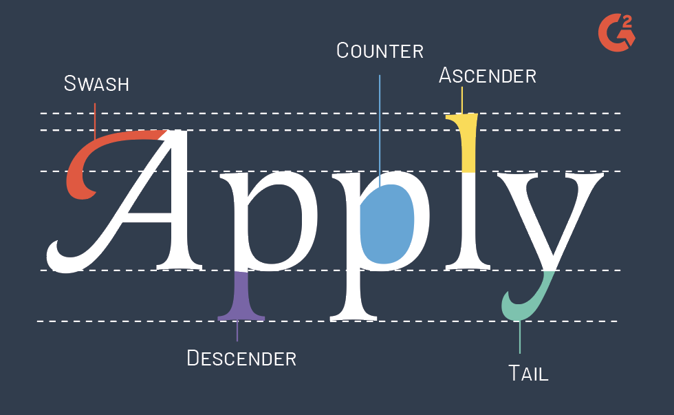
5. Anatomía del tipo
Hay mucho sucediendo detrás de escena de estos caracteres.

Ascendente
Un ascendente es la parte de una letra minúscula que se extiende por encima de la altura x. Por ejemplo, las letras d, f, k y t tienen ascendentes.
Contador
El área de la letra que está total o parcialmente cerrada por un trazo. El trazo que crea el contador se llama "bowl".
Descendente
La parte de una letra minúscula que se extiende por debajo de la línea base. Por ejemplo, las letras p y q son descendentes.
Swash
Una extensión exagerada de una parte de un carácter, como la serifa o la cola. Son muy elegantes.
Cola
Un descendente decorativo en un carácter. Por ejemplo, los descendentes en Q, K, R, g, j, p, q y y son colas.
Línea de ascendente
Esta es la línea imaginaria que marca la altura de los ascendentes.
Línea de mayúsculas
Esta es la línea imaginaria que define la altura que alcanzarán la mayoría de las letras mayúsculas. La altura de la mayúscula se utiliza para medir la altura de las letras mayúsculas de parte superior plana.
Línea base
La línea imaginaria marca la línea donde se asientan la mayoría de las letras dentro de una fuente. Es como la línea del horizonte de la tipografía.
Línea de barba
También conocida como línea de descendente, la línea de barba es una línea imaginaria que los descendentes en una fuente alcanzarán. Si piensas en los descendentes como barbas, esto es hasta dónde crecen.
Altura x
También llamada tamaño del corpus, esta es la distancia entre la línea base y la altura promedio de las letras minúsculas en el tipo de letra. A menudo, esta es la altura de la "x" en la fuente, de ahí el nombre "altura x".
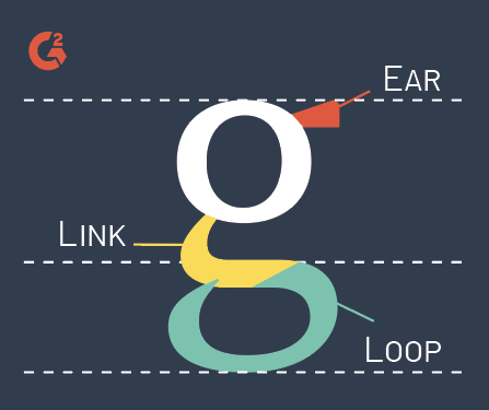
 Oreja
Oreja
A menudo se encuentra en la "g" minúscula, la oreja es un trazo decorativo que se proyecta desde el lado superior derecho del bowl.
Enlace
También conocido como cuello, un enlace es lo que conecta (enlaza) el bowl y el lazo de una "g" de doble piso.
Lazo
En una "g" de doble piso, el lazo es el contador cerrado o parcialmente cerrado debajo de la línea base. Los lazos también ocurren en b, p y l cursivas.
Barra
La barra, o barra transversal, es una línea horizontal en una forma de letra. Actúa como una conexión entre dos trazos.
Pico
El trazo decorativo al final del brazo de un carácter con serifa está conectado por un terminal.
Bowl
Este es el trazo curvo del carácter que crea el espacio llamado "contador".
Minúscula
Otra forma de describir una letra minúscula.
Mayúscula
Otra forma de describir una letra mayúscula.
Serifa
Una pequeña proyección de un trazo de un carácter en tipos de letra con serifas.
Hombro
El trazo curvo que se proyecta desde el tallo de un carácter que apunta hacia abajo. Esto ocurre en h, m y n.
Espina
El trazo central, de izquierda a derecha, que se curva en la letra "s". Dependiendo del tipo de letra, la espina puede ser casi vertical o casi horizontal.
Terminal
Un tipo de curva. Algunos consideran que el terminal es simplemente un trazo de una letra con serifa que termina sin una serifa.

Brazo/Pierna
Un brazo o pierna en tipografía es un elemento superior o inferior de un carácter que se ramifica desde un trazo ya sea horizontal o diagonalmente.
Eje
Esta es una línea imaginaria que biseca un carácter para determinar el ángulo de tensión en glifos que tienen diferentes grosores de trazo. Un eje vertical indica cero tensión vertical.
Espolón
Una proyección del trazo principal que es más pequeña que una serifa o pico.
Tallo
Como una flor, el tallo es lo que mantiene todo unido. Es el trazo vertical principal en caracteres verticales.

Tensión
El cambio de ancho de trazo a través de caracteres dentro de una fuente. La tensión puede ser vertical o diagonal y se mide por el "eje". En fuentes donde no hay un cambio obvio en el ancho del trazo, no hay tensión. Para nadie.
Trazo
Las líneas que componen las partes principales de un carácter son secundarias al tallo. Brazos, piernas, barras, bowls y tallos a veces se refieren como trazos.
6. Unidades de medida en tipografía
Punto
Los puntos son la unidad de medida más pequeña. Se utilizan para medir el tamaño de la fuente, el interlineado y otros asuntos espaciales tanto en tipografía como en diseño gráfico en general. Hay 72 puntos en una pulgada.
Pica
La pica es otra unidad de medida tipográfica utilizada en software de diseño. Es equivalente a aproximadamente ⅙ de pulgada, o 1/72 de pie. Una pica se divide en 12 puntos.

Buena construcción de caracteres
¿Quién sabía que la tipografía era tan intrincada? Hay muchas cosas que pasan desapercibidas en nuestro mundo, y el ajuste fino que los tipógrafos hacen a nuestras palabras es una de ellas. La tipografía es más que simplemente escribir una palabra e imprimirla. Se trata de ajustar y pulir cada último espolón y swash hasta que las palabras se conviertan en arte por sí mismas.
La tipografía es una habilidad vital en el diseño gráfico, pero no es la única. Sumérgete en las habilidades esenciales de diseño gráfico necesarias para sobresalir en este campo creativo.
Este artículo fue publicado originalmente en 2019. Ha sido actualizado con nueva información.

Daniella Alscher
Daniella Alscher is a Brand Designer for G2. When she's not reading or writing, she's spending time with her dog, watching a true crime documentary on Netflix, or trying to learn something completely new. (she/her/hers)

