


Una imagen vale más que mil palabras — a veces, vale una empresa de mil millones de dólares.
Es imposible decir cuántos logotipos existen.
Son utilizados por cafeterías, agencias de diseño, empresas de software, fabricantes de automóviles, marcas de ropa, revistas, proveedores de transporte público, canales de televisión, y la lista continúa.
Es abrumador, por decir lo menos.
Pero, ¿sabías que hay un método para la locura de los logotipos?
Si estás pensando en diseñar un logotipo para un cliente o para ti mismo, ¡no temas! Este artículo te ayudará a reducir tus opciones mientras analizamos los 3 tipos de logotipos y los pros y contras de usar cada tipo.
Cuando estés listo, puedes navegar por algunos de los software de diseño de logotipos y decidir cuál funciona mejor para lo que estás creando.
Los 3 tipos de logotipos
Los logotipos vienen en muchas formas.
Puede que reconozcas un logotipo perteneciente a una empresa porque es simplemente el nombre de la empresa. En otros casos, puedes reconocer un logotipo sin ninguna palabra. Por supuesto, las imágenes y la tipografía siempre se pueden combinar para crear un logotipo inolvidable.

1. Logotipos tipográficos
Algunos pueden pensar que un logotipo sin imagen es aburrido.
Con especial atención al espaciado, la forma y el color, sin embargo, el texto puede convertirse en una imagen en sí mismo.
Hay algunas direcciones que podrías tomar con un logotipo tipográfico.
Monogramas (letras)
Administración Nacional de Aeronáutica y del Espacio. Home Box Office. International Business Machines. British Broadcasting Corporation.
¿Te suena alguno de estos?

Un logotipo de monograma utiliza las iniciales del nombre de una empresa para abreviarlo y crear una identidad adicional. Las empresas con nombres largos que pueden no estar en la punta de tu lengua usan monogramas para hacer que su identidad sea más fácil de recordar.
La tipografía de un monograma no solo debe estar alineada con la marca de la empresa, sino que también debe ser legible. Las letras son la única parte del logotipo: si no se pueden leer, esta popular forma de ser recordado fracasará. No mires las letras como letras; míralas como un lienzo de diseño. Hay muchas maneras de aprovechar su diseño.
Hay una abundancia de empresas que aprovechan este tipo de logotipo, y gracias a Dios que lo hacen. ¿Te imaginas tener que referirte a la NASA como Administración Nacional de Aeronáutica y del Espacio todos los días de tu vida? ¡Uf!
¿Deberías usar un monograma?
Los monogramas son fantásticos si la empresa que representas tiene un nombre que podría condensarse para hacerlo más memorable y fácil de decir. Los monogramas son muy fáciles de replicar en materiales de marketing, desde una plataforma tan grande como una cartelera hasta un pequeño diseño de tarjeta de presentación. Además, si acortar el nombre de tu empresa a un monograma es común en tu industria (tecnología, televisión), ¡considera esta opción!
No se debe usar un monograma si no es necesario. Si el nombre de tu empresa es simple y fácil de recordar, echa un vistazo a la siguiente opción en su lugar.
Al diseñar un monograma, ¡no lo dejes solo! Dale un ángulo diferente para que el logotipo parezca más que un par de letras.
Logotipos de palabras (logotipos)
Los logotipos de palabras, o logotipos, se consideran la forma más directa de expresión de marca.
Similar a un monograma, los logotipos de palabras son logotipos compuestos únicamente por letras. En lugar de iniciales, los logotipos de palabras utilizan el nombre completo de la empresa y utilizan la tipografía para destacarse.

Pero eso significa que los diseñadores realmente tienen que centrarse en la tipografía. Nuevamente, las fuentes y los colores elegidos deben alinearse con la marca y, posiblemente más importante, ser legibles.
No tiene que haber ningún significado oculto o simbolismo detrás del logotipo, pero si te sientes extra creativo y mueres por agregar algo extra, ¡siempre es algo divertido y trivial para incluir!

¿Deberías usar un logotipo de palabras?
Los logotipos de palabras son útiles para que se reconozca el nombre de tu empresa y son útiles para empresas con nombres únicos para hacerlos destacar aún más. Además, los logotipos de palabras también son fáciles de replicar en materiales de marketing, siempre que sean simples.
Algo a recordar con los logotipos de palabras es la relevancia de la fuente. Si una empresa hizo su logotipo de palabras en Comic Sans, eso podría haber estado bien en 2001. Pero a nadie le gusta Comic Sans ahora, y si a nadie le gusta Comic Sans, a nadie le gustarás tú.
RELACIONADO: ¿Has visto el último cambio de imagen de Helvetica? Echa un vistazo a Helvetica Now.
Los logotipos de palabras deben evitarse si el nombre de tu empresa es un poco largo. Si este es el caso, consulta la opción anterior o sigue leyendo.
2. Logotipos de iconos e imágenes
A veces, es mejor dejar que las imágenes hablen.
Marcas pictóricas (símbolo de logotipo, marca de marca)
No soy adivino de ninguna manera, pero puedo casi garantizar que este es el tipo de logotipo en el que piensas cuando ves la palabra "logotipo".
Las marcas pictóricas, a veces denominadas símbolo de logotipo o marca de marca, son exclusivamente imágenes, sin ningún texto, que a menudo toman una representación literal de la marca a la que pertenecen. El icono es algo que la gente puede identificar fácilmente, como una manzana o una concha.

¿Deberías usar una marca pictórica?
Si el nombre de tu empresa está simplemente pidiendo un icono, absolutamente. Dove es un ejemplo obvio... ¿cómo podrías no aprovechar eso? También son una elección estratégica si estás buscando impulsar la personalidad de tu marca un poco más allá de solo tu nombre.
Las marcas pictóricas deben usarse en combinación con logotipos tipográficos si tu empresa no es ampliamente conocida. Hay muy pocas empresas que pueden salirse con la suya usando exclusivamente su logotipo pictórico, y esas empresas que pueden son generalmente enormes.
Finalmente, asegúrate de haber realmente establecido tu marca antes de elegir un logotipo pictórico. Similar a decir "te amo", decidir sobre una marca pictórica realmente puede atarte.
Marcas abstractas
Algunas marcas pictóricas dicen lo que significan. Las marcas abstractas... no.
Las marcas abstractas son un tipo de logotipo pictórico que son irreconocibles. Mientras que muchas marcas pictóricas representan cosas con las que estamos al menos algo familiarizados, las marcas abstractas están hechas de formas geométricas y son completamente conceptuales.
Debido a su singularidad, fomentan el reconocimiento inmediato.
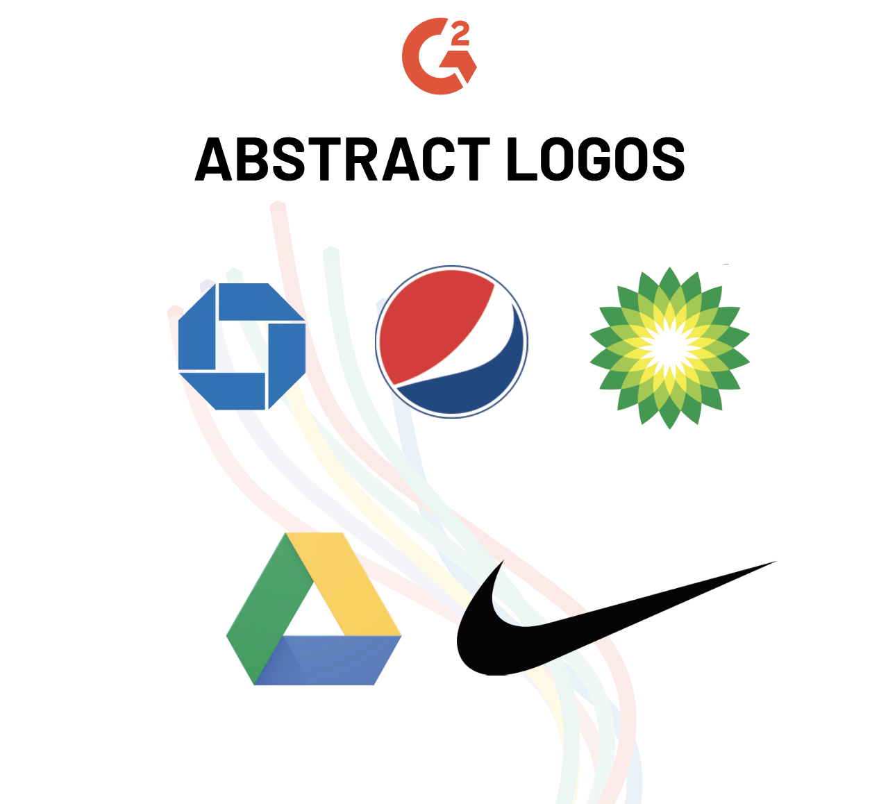
¿Deberías usar una marca abstracta?
Las marcas abstractas funcionan bien si tu empresa quiere un logotipo un poco menos obvio que la marca pictórica tradicional. Son completamente únicas para la empresa para la que han sido diseñadas y son un imán para que las enormes empresas con sucursales en todo el mundo vuelvan a ellas. Las marcas abstractas no significan nada; la empresa decide lo que significa para ellos y sus clientes.
Ten en cuenta que las marcas abstractas pueden ser extremadamente difíciles de diseñar. Es como inventar un color nuevo; una marca abstracta es única en su tipo. En el mundo de hoy, sobrepoblado de logotipos y símbolos, no es tan fácil sacar uno de estos de un sombrero.
Las marcas abstractas también tienen el potencial de causar un poco de confusión entre el público. Si no has solidificado tu identidad de marca, mantente alejado de estas. Las marcas abstractas no tienen un significado "real" detrás de ellas, lo que significa que tu marca debe asignar uno. Si no sabes lo que representa tu propia marca, estarás haciendo muchas revisiones, lo que no se ve bien para la estabilidad de tu negocio.
Mascotas
Asustan a los niños pequeños, pero funcionan.
Las mascotas se usaron originalmente para traer entretenimiento y emoción a una empresa. Hoy en día, se utilizan para impulsar aún más la emoción que una marca quiere llevar a su audiencia: fuerza, diversión, confianza, amistad, aventura, y así sucesivamente.
Las mascotas a menudo tienen un diseño más complejo que un símbolo de logotipo o logotipo de palabras porque son un personaje completo: humano, animal o de otro tipo (te estamos mirando, Michelin Man).

¿Deberías usar una mascota?
Las mascotas son una elección inteligente para hacer para tu logotipo si estás buscando algo dinámico. Las mascotas pueden ser 2D, animadas o, si estás muy interesado en mejorar la experiencia del cliente, un disfraz. Aprovechar todas estas formas realmente puede ayudarte a comenzar a crear una relación con tus clientes y clientes.
Al igual que las personas crecen y cambian, las mascotas son una solución fácil si tu empresa desea un poco de flexibilidad cuando se trata de la evolución del logotipo.
Ten cuidado al usar una mascota como tu única forma de logotipo. Aunque son divertidas y caprichosas, hay momentos en los que tu empresa estará mejor estableciendo un tono serio. Las mascotas pueden ser parte de tus materiales de marketing, pero no deben ser la única parte. Un diseño de mascota es como la cereza en la cima de todo lo demás.
3. Ambos
Algunas empresas tendrán un logotipo tipográfico. Algunas empresas tendrán un logotipo de icono. Muchas veces, estas empresas son las mismas. A menudo, los logotipos tipográficos e iconográficos van de la mano para un elemento excepcionalmente fuerte. Hay algunas maneras de ejecutar esto en un logotipo:
Emblemas
Los emblemas, simplemente, son fuente dentro de un símbolo. Este símbolo podría ser una insignia, un escudo o un sello. Los emblemas son un poco anticuados y clásicos, lo que los convierte en una opción distintiva para un logotipo. A menudo se ven representando escuelas, automóviles y organizaciones gubernamentales.
Emiten elegancia y estilo, pero no son para todos.

¿Deberías usar un emblema?
Los emblemas dan una vibra tradicional, lo cual es genial si coincide con tu marca. Son muy fáciles de reconocer para una audiencia y funcionan bien para parches en uniformes.
Sin embargo, la escalabilidad se convierte en un problema con los emblemas. Trabaja para diseñar el emblema lo más simple posible para que cuando se reduzca, todo siga siendo legible.
Los emblemas tampoco son muy versátiles porque el símbolo y el texto están tan estrechamente vinculados.
Marcas combinadas
Las marcas combinadas son exactamente lo que parecen: logotipos de palabras o letras combinados con marcas pictóricas, marcas abstractas o mascotas.
No hay reglas sobre cómo disponer estos elementos. Los logotipos de palabras pueden apilarse sobre marcas pictóricas, los logotipos de letras pueden colocarse a la izquierda de una marca abstracta, las mascotas pueden posicionarse detrás de un logotipo de palabras. Juega con ello y encuentra algo que sea atractivo a la vista y tenga sentido para todos.

¿Deberías usar una marca combinada?
Debido a que las marcas combinadas son tan específicas para la marca que representan, son mucho más fáciles de registrar. Los elementos combinados crean una imagen fuerte y memorable para la audiencia y, debido a que inicialmente se usan en combinación, estos elementos pueden separarse más tarde y usarse independientemente unos de otros y aún así vincularse a lo mismo: tu negocio.
Sin embargo, si tu negocio es uno enfocado en la simplicidad, puede que no sea necesario combinar tantos elementos. Las marcas combinadas pueden volverse abrumadoras y confusas para los clientes si hay demasiado en juego.
¿Qué tipo de logotipo es adecuado para ti y tu empresa?
¡Un pequeño símbolo es mucho más complicado de lo que inicialmente pensamos! Crear un logotipo lleva mucho tiempo, pensamiento introspectivo, investigación y paciencia tanto para el diseñador como para la empresa. No te desanimes por el proceso de prueba y error.
Tu logotipo es uno que estará disponible tanto en impresión como en la web. Se imprimirá en diferentes materiales, se escalará al tamaño de una cartelera y se usará en redes sociales. Cuanto más versátiles sean tus opciones de logotipo, mejor.
¿Te preguntas en qué tipos de materiales de marketing puedes implementar tu logotipo? Lee más sobre diseño gráfico y marketing.
¿Quieres aprender más sobre Software de autoedición? Explora los productos de Publicación de escritorio.

Daniella Alscher
Daniella Alscher is a Brand Designer for G2. When she's not reading or writing, she's spending time with her dog, watching a true crime documentary on Netflix, or trying to learn something completely new. (she/her/hers)

