


Wenn man ausgeht, kann das Tragen einer bestimmten Art von Kleidung den Ruf machen oder brechen.
Es wäre seltsam, wenn Sie in einem Bikini im Büro auftauchen würden.
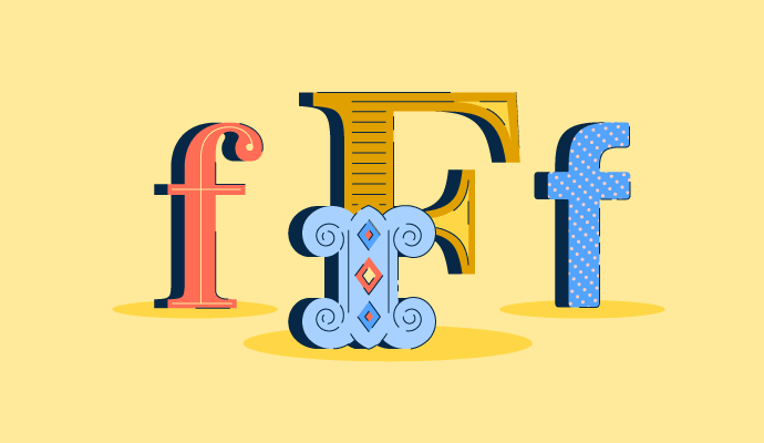
Ebenso merkwürdig wäre es, eine Fraktur-Schriftart für Ihre Reiseplanung zu verwenden.
Beim Designen von allem - einer Website, einem Poster, einem Lebenslauf - ist die Wahl der Typografie entscheidend.
Die 4 Schriftarten
Wenn Sie jemals die Liste der Schriftarten in einer Dokumentenerstellungssoftware durchstöbert haben, wissen Sie, dass es ziemlich verrückt werden kann. Es gibt Schriftarten für alltägliche Dokumente, Schriftarten für Logodesign, Schriftarten, die besser für Überschriften geeignet sind. Dann gibt es diese Schriftarten, die man niemals verwenden würde.
Es gibt Tausende von verschiedenen Schriftarten, und jeden Tag kommen neue hinzu. Diese riesige Dropdown-Liste wird zunehmend einschüchternd. Wie könnte man wissen, welche man verwenden soll?
Wenn Sie nicht sicher sind, wo Sie anfangen sollen, schauen Sie sich die folgenden Kategorien an, die Ihnen helfen, diese Liste zu vereinfachen und ein besseres Verständnis dafür zu gewinnen, welche Kategorie von Schriftarten für Ihr Design geeignet ist.

Während Sie lesen, können Sie sich gerne mit einigen der Web-Schriftarten-Marktplatz-Software vertraut machen. Diese Tools sind ein großartiger Ort, um herumzustöbern und Schriftarten, die Ihnen gefallen, direkt auf Ihren Desktop herunterzuladen.
Serif
Das Wort „Serif“ selbst wird verwendet, um Zeichen zu beschreiben, die Linien haben, die vom Ende jedes Strichs ausgehen.
Obwohl der genaue Ursprung dieser Schriftart unbekannt ist, gibt es eine weit verbreitete Theorie, dass sie von den Römern entwickelt wurde, als sie Zeichen in Stein meißelten, um die Enden der Zeichen zu säubern. Unabhängig vom Ursprung ist diese Schriftart auch heute noch präsent.
Historisch gesehen sind Serifen besser für den Druck und in größeren Größen geeignet, da ihre kleinen Details dem menschlichen Auge helfen, die Form des Buchstabens zu erkennen.
Serifenschriften können in mehrere Unterkategorien eingeteilt werden.

Old Style
Old Style-Serifen zeichnen sich durch kleine Kontraste zwischen dicken und dünnen Strichen aus. In einigen Versionen ist das kleine „e“ in einem Winkel geneigt. Old Style wird in großen Textblöcken verwendet, insbesondere im Druck.

Transitional
Transitional-Serifen sind der Übergang zwischen Old Style und modernen Serifen. Ihre Kopfserifen sind horizontaler als die der Old Style-Serifen, und ihre Serifen sind allmählich gekrümmt.

Modern
Moderne oder Didone-Serifen zeichnen sich durch ihren intensiven Kontrast zwischen dünnen und dicken Strichen aus. Ihre Klammern sind minimal und es gibt einen intensiven vertikalen Stress. Diese Schriftarten wirken oft sehr edel.

Slab
Slab-Serifen, manchmal auch quadratische Serifen genannt, wirken viel lässiger und haben dickere, blockartige Serifen. Die Enden der Serifen selbst können scharf oder abgerundet sein. Sie wurden ursprünglich für Poster als aufmerksamkeitsstarke Technik mit ihrem lauten Erscheinungsbild entworfen.

Glyphic
Glyphic-Serifen sind durch ihre dreieckigen Serifen oder sich verjüngenden Striche gekennzeichnet. Sie werden „Glyphic“ genannt, weil ihre Schriftarten Zeichen ähneln, die in Stein oder Metall eingraviert wurden. Die Glyphic-Serifen legen oft Wert auf Großbuchstaben, was bedeutet, dass einige Schriftarten möglicherweise keine Kleinbuchstabenoptionen bieten.

Möchten Sie mehr über Schriftverwaltungssoftware erfahren? Erkunden Sie Schriftverwaltung Produkte.
Sans Serif
Das Wort „sans“ stammt aus dem Französischen und bedeutet einfach „ohne“. Sans-Serif-Schriften sind daher Schriften ohne Serifen, die Minimalismus und Einfachheit vermitteln.
Im Druck werden Sans-Serif-Schriften oft in Überschriften verwendet.
Online sind sie der letzte Schrei. Der Grund dafür ist, dass auf niedrigauflösenden digitalen Displays (die wahrscheinlich nicht mehr existieren) die kleinen Details in Serifenschriften verzerrt oder ganz verschwanden. Sans Serif hält die Dinge sauber und ordentlich.
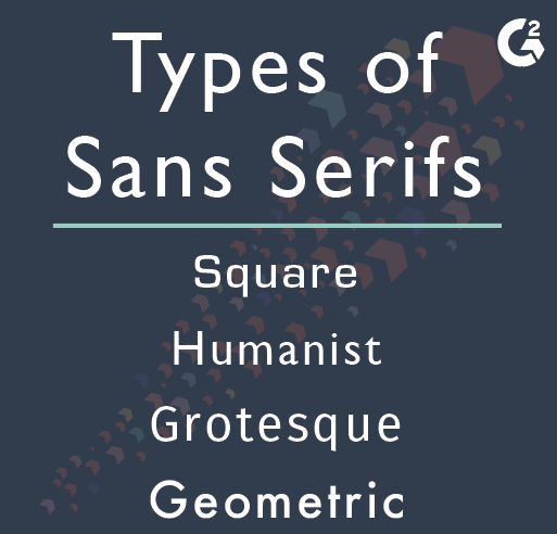
Square
Wie der Name schon sagt, sind quadratische Sans-Serifen Schriftarten, die quadratisch aussehen. Die Schriftarten haben wenig bis keine Kurven.

Humanist
Großbuchstaben, die genauso gestaltet sind wie die Römer, emuliert die humanistische Sans-Serif die Präsenz der Hand. Humanistische Sans-Serif-Schriftarten haben definitiv etwas mehr Persönlichkeit als die mechanisch aussehenden quadratischen Sans-Serifen. Sie sind wohl die am besten lesbaren der Sans-Serifen und werden oft im Website-Text verwendet.

Grotesque
Sie sind nicht wirklich so hässlich. Grotesk wird manchmal synonym mit Sans-Serif verwendet, bezieht sich aber auch auf eine Unterkategorie von Schriftarten innerhalb des Sans-Serif-Dachbegriffs. Groteske Sans-Serifen sind leicht an ihren Schleifen am unteren Ende ihrer kleinen „g“s und der Konsistenz des Gewichts zwischen den Zeichen zu erkennen.

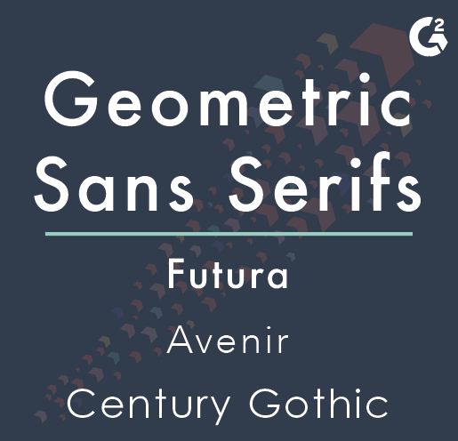
Geometric
Geometrische Sans-Serifen basieren stark auf kreisförmigen Formen. Obwohl sie die modernsten der Sans-Serifen sind, werden geometrische Schriftarten selten im Web-Text verwendet. Sie gehen ein wenig zu weit für große Mengen an Lesematerial, aber sie funktionieren definitiv für eigenständige Titel und futuristische Branding-Typografie.
Script
Jetzt wird es schick. Script-Schriftarten spiegeln handgeschriebene Schriftstile wider. Sie wirken oft elegant, aber es gibt einige Schriftarten, die einen viel unbeschwerteren Look haben.
Script-Schriften sollten nicht die Schriftart der Wahl für offizielle Geschäftsdokumente sein, wie z.B. einen Grafikdesign-Vertrag, aufgrund ihrer Lesbarkeit. Verwenden Sie stattdessen diese Schriftarten auf dem Cover eines saftigen Liebesromans oder auf Ihren Hochzeitseinladungen.
Spezielle Schriftarten sollten für besondere Anlässe aufbewahrt werden.
Formal
Formale Script-Schriftarten sind elegant. Inspiriert von der Kalligraphie des 17. und 18. Jahrhunderts fließen und schlingen sie sich anmutig. Ihre Kleinbuchstaben verbinden sich typischerweise, genau wie sie es tun würden, wenn Sie in Schreibschrift schreiben würden. Erinnern Sie sich an Schreibschrift?

Casual
Diese Schriftarten sind sehr informell und sehen aus, als hätte jemand schnell eine Notiz geschrieben. Ihre Persönlichkeiten sind alles andere als schwach und können manchmal ein wenig zu stark sein. Wenn Sie ein lässiges Script in Ihrem Design verwenden, stellen Sie sicher, dass die Schriftart lesbar ist und das Gesamtdesign nicht widerspricht.

Blackletter
Blackletter-Schriftarten sind so gestaltet, als wären sie mit Feder und Tinte geschrieben worden, weil sie es waren. Auch bekannt als gotische Schrift, wurde die Blackletter-Schrift von der 12. bis ins 17. Jahrhundert in Westeuropa verwendet. Mit anderen Worten, sie ist sehr alt.
Die Blackletter-Schriftarten wirken sehr Shakespearean und dramatisch. Wenn es zu Ihrer Markenidentität passt, können Blackletter-Schriften Ihnen helfen, sich abzuheben.

Calligraphic
Diese Kategorie von kalligrafischen Schriftarten ist breit gefächert. Es gibt kein einziges Merkmal, das diese Schriftarten zusammenführt, außer dass sie aussehen, als wären sie von einem Kalligraphen mit einem Pinsel oder einem Flachstift geschrieben worden.

Decorative
Dekorative Schriftarten sind extrem vielfältig und werden fast nie für Textblöcke verwendet, egal ob online oder gedruckt. Verwenden Sie diese Schriftarten nur für Anzeigezwecke. Sie heißen dekorativ aus einem Grund.
Dekorative Schriftarten passen in keine der vorherigen Kategorien, was bedeutet, dass es keine Regeln oder identifizierenden Merkmale zwischen ihnen gibt.
Sie können sehr emotional sein, verschiedene Zeitperioden suggerieren und sind völlig originell und einzigartig.
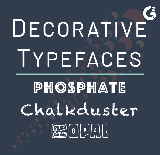
Es gibt keine offiziellen Unterkategorien von dekorativen Schriftarten - genau so unorthodox sind sie. Es gibt Graffiti-Schriften, Grunge-Schriften, Schablonenschriften, psychedelische Schriften. Wenn Sie versuchen, eine bestimmte Stimmung mit Ihrem Design zu vermitteln, sollten Sie etwas mit ein wenig Attitüde in Betracht ziehen.
Zähmen Sie das Biest
Die Anzahl der Schriftoptionen kann für jeden zu einem verschwommenen Bild werden - sogar für Grafikdesigner. Oft behalten wir einige, die wir religiös verwenden, und lassen den Rest weg. Wenn Sie ein neues Projekt haben, das von Ihnen verlangt, etwas anderes zu vermitteln als alles, was Sie zuvor getan haben, denken Sie darüber nach, diese Liste noch einmal zu überprüfen. Oder sogar erstellen Sie Ihre eigene Schriftart!
Designen Sie online? Stellen Sie sicher, dass Sie die beste Typografie für Websites wählen.

Daniella Alscher
Daniella Alscher is a Brand Designer for G2. When she's not reading or writing, she's spending time with her dog, watching a true crime documentary on Netflix, or trying to learn something completely new. (she/her/hers)

