


Es gibt nichts Erfrischenderes, als sich die Zähne zu putzen und dann einen Schluck frischen Orangensaft zu nehmen. Richtig?
Falsch. Wenn du denkst, das sei in Ordnung, weiß ich nicht, wie du nachts schlafen kannst.
Das Gleiche gilt für jeden, der denkt, es sei in Ordnung, eine schwarze Schriftart mit einer Schreibschrift in einem Broschürendesign zu kombinieren. Wenn du denkst, das sei eine akzeptable Kombination, hör auf, was du tust, und lies weiter.
Ein Leitfaden zur Schriftartenkombination
Die Kombination von Schriftarten ist eine der schwierigsten, aber oft übersehenen Aufgaben im Design. Es ist nicht nur etwas, worüber sich Grafikdesigner Gedanken machen müssen. Wenn du eine PowerPoint-Präsentation für eine Verkaufspräsentation erstellst oder einen Vertrag für einen Kunden schreibst, solltest du dir auch Gedanken über die Kombination von Schriftarten machen.
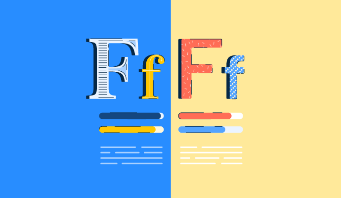
Schriftarten haben die Fähigkeit, Aufmerksamkeit zu erregen, Emotionen zu vermitteln und sogar eines der wichtigsten Markenelemente eines Unternehmens zu sein. Da sie so wirkungsvoll sind, ist es wichtig, dass die von dir gewählten Schriftarten zusammenpassen.
Woher sollst du all diese Schriftarten überhaupt nehmen? Software für Web-Schriftarten-Marktplätze ermöglicht es Designern, Schriftarten für geschäftliche Projekte oder persönliche Bedürfnisse zu finden und zu kaufen, und die Auswahl scheint endlos zu sein.
Möchten Sie mehr über Schriftverwaltungssoftware erfahren? Erkunden Sie Schriftverwaltung Produkte.
Zu vermeidende Praktiken bei der Schriftartenkombination
Im Design gibt es keine Regeln. Es gibt unendliche Farbkombinationen, Platzierungsoptionen für Elemente und Möglichkeiten zur Kombination von Schriftarten. Aber nur weil es unendlich viele gute Möglichkeiten gibt, heißt das nicht, dass es keine schlechten Ideen gibt.
In diesem Artikel werden wir einige Dinge durchgehen, die du beim Kombinieren von Schriftarten vermeiden solltest, damit deine Arbeit die Augen der Menschen auf eine gute Weise zum Tränen bringt. Nicht auf eine schlechte Weise.
Unausgewogener Kontrast
Man könnte denken, dass man sicher ist, solange man Schriftarten kombiniert, die ähnlich aussehen.
Genau das Gegenteil.
Das Kombinieren von Schriftarten, die sich extrem ähneln, kann zu Konflikten und Verwirrung führen.
Gleichzeitig werden Schriftarten, die keine Beziehung zueinander haben, nicht so schnell Kinder bekommen. Schriftartenpaare, die nichts gemeinsam haben, werden für das Publikum kein einheitliches Gefühl vermitteln.
Stattdessen übersetzt sich die ganze Aufregung dieser einzigartigen Schriftarten in Zufälligkeit und Verwirrung. Infolgedessen werden diese Paare die Betrachter abschrecken.

Ist das ein Risiko, das du eingehen möchtest?
Zu viele Schriftarten
Es gibt Tausende von Schriftarten zur Auswahl, wenn du nach ein paar suchst, die gut zusammenpassen. Jetzt ist keine gute Zeit, unentschlossen zu sein.
Die Faustregel ist, nicht mehr als drei Schriftarten für dein Projekt zu kombinieren.
Während viele Projekte davon profitieren, sich an diese Regel zu halten, ist sie nicht in Stein gemeißelt. Es gibt viele aufwendige Designs, die mehr als drei verwenden, aber es gibt so etwas wie Übertreibung. Wenn du über drei Schriftarten hinausgehst, stelle sicher, dass sie in Harmonie arbeiten, nicht im Chaos.

Praktiken zur Schriftartenkombination, die man anwenden sollte
Ich werde dich nicht nur mit ein paar Warnungen zurücklassen. Die folgenden Tipps bieten ein wenig zusätzliche Orientierung.
Kombiniere Schriftarten aus derselben Familie
Eine Sammlung verwandter Schriftarten wird als Schriftfamilie bezeichnet. Zum Beispiel ist Helvetica Neue eine Schriftfamilie. Innerhalb dieser oder einer anderen Schriftfamilie könnte man ein paar Variationen ohne Risiko kombinieren.

Wenn dein Projekt keine ausgefallenen Schriftarten erfordert, ist dies ein einfacher Ausweg aus dem Stress der Schriftartenkombination.
Kombiniere Schriftartenarten (vorsichtig)
Wenn du dich nicht auf eine Schriftart oder sogar eine Familie beschränken möchtest, denke darüber nach, verschiedene Schriftartenarten zu kombinieren. Beim Kombinieren solltest du daran denken, dass der Kontrast zwischen Schriftarten etwas ist, das vorsichtig ausbalanciert werden muss.
Nachfolgend sind die allgemeinen Best Practices für die Kombination von Schriftarten aufgeführt:

Kombiniere Auffälliges mit Gewöhnlichem
Schriftarten sind aufregend, aber wir können nur so viel Aufregung auf einmal ertragen. Wenn deine Hauptschriftart viel Persönlichkeit hat, stelle sicher, dass deine zweite Schriftart eine eher generische Rolle hat. Dekorative und Schreibschriftarten sollten selten, wenn überhaupt, für Fließtext verwendet werden. Wenn du dich entscheidest, sie zu verwenden, hebe sie für Überschriften und Anzeigen auf.

Es ist wichtig, sich daran zu erinnern, dass hinter all den wilden Schriftarten die Worte stehen, die du deinem Publikum vermitteln möchtest. Wenn deine Schriftartenkombinationen außer Kontrolle geraten, wird die Typografie den Inhalt selbst überschatten.
Wenn alles aufregend ist, dann ist nichts aufregend.
Gewicht und Größe
Der Grund für die Kombination von Schriftarten ist es, Informationen voneinander zu unterscheiden. Während die Auswahl einiger Schriftarten einen Teil deines Inhalts anders aussehen lassen kann als einen anderen, reicht das oft nicht aus.

Das Spielen mit Größe und Gewicht schafft eine typografische Hierarchie, die es den Lesern erleichtert zu verstehen, was wichtig ist und wie du möchtest, dass sie die Informationen lesen.
Ressourcen zur Schriftartenkombination
Die Kombination von Schriftarten kann anstrengend sein, und es ist unmöglich, dass jemand alle Kombinationen, die funktionieren, auswendig kennt. Zum Glück haben wir das Internet.
Font Pair ist ein Typografie-Website-Tool, das Designern bei der Kombination von Schriftarten hilft und sie inspiriert. Du kannst durch ihre vorgestellten Paare scrollen oder dich ein wenig spezifischer mit den verschiedenen Schriftartenarten befassen. Font Pair ermöglicht es dir auch, das Schriftartenpaar, das du liebst, direkt von ihrer Website herunterzuladen.
Typespiration bietet Schriftartenkombinationen, die von Designern beigetragen wurden, die sie in ihren Projekten verwendet haben. Unter jedem Beispiel befindet sich eine Liste der Schriftarten, die der Designer verwendet hat, die implementierten Farben und sogar der CSS-Code, den du auf deiner eigenen Website verwenden kannst.
Typ.io ist eine Website, die den Zuschauern Zugang zu einigen der heißesten Landingpages und dem, was dahinter steckt, bietet, einschließlich der Schriftartenwahl der Designer und wie sie sie auf der Seite verwendet haben.
Das Gute, das Schlechte und das Hässliche
Die Kombination von Schriftarten ist eine Kunst und eine Wissenschaft; sie muss präzise und mit Stil durchgeführt werden. Es gibt keinen richtigen Weg, es zu tun, aber es gibt definitiv einen falschen Weg, den man vermeiden sollte. Sei nicht schüchtern, wenn du ein wenig Hilfe brauchst; es ist besser, um Hilfe zu bitten und deine Kombination richtig zu machen, als den Kopf hoch zu halten und etwas Schreckliches zu präsentieren. Hab keine Angst zu experimentieren und dir Zeit zu nehmen. Vielleicht stößt du auf eine Kombination, die noch niemand gesehen hat!
Erfahre mehr über die wesentlichen Fähigkeiten im Grafikdesign und verbessere deine Designfähigkeiten.

Daniella Alscher
Daniella Alscher is a Brand Designer for G2. When she's not reading or writing, she's spending time with her dog, watching a true crime documentary on Netflix, or trying to learn something completely new. (she/her/hers)

