
Here’s your problem statement: Make a good impression in three seconds.
Seems challenging, doesn’t it?
Websites are the face of a company, and businesses have taken that analogy very seriously. Today’s web designers seem to possess an arsenal of more features and page elements than they did a few years back. Gone are the days when a video or bright, colorful images were sufficient to be hailed as a memorable website. Modern pages now include interactive elements that give a static page some movement and life.
Even the humble splash page has received a significant makeover. What was once construed to be a terrible experience for visitors that seemed to have no purpose other than, say, giving a warning, or acting like a block-colored wall, splash pages today are back and better than ever. If you want your website features to make visitors stick around, you have to keep them engaged. From catchy and informative copy to imaginative images and gifs, splash pages are meant to tease your users before entering the main homepage.
What is a splash page?
A splash page, or splash screen, is a large window that serves as an introductory page and appears as the first page before a user enters a website. The splash page provides a simple intro message, promotes a product or event, offers exclusive deals, or even warns users of the necessary information. It generally consists of a sentence or two, an image, and an exit link.
Splash pages have received a lot of flak in the past – especially in the mid-to-late 2000s – and experts considered it a feature that aged a website. To be fair, splash pages in the yesteryears were clunky and didn’t offer the best user experience. However, they have slowly seen a resurgence over the past couple of years, with websites increasingly incorporating the splash pages in their design blueprint.
So what’s changed?
Simply put, our tastes have changed dramatically. We went from paper to digital so fast that websites became our new magazines, books, and banner hoardings. Humans are visual creatures by nature, and our fascination with design and visuals has shaped the way websites are designed and developed. With faster internet speeds, we now have time to appreciate something like a splash page (the one that’s done well, of course). Many experts believe that the splash page is due for a revival. And why not? Our love for all things digital has resulted in a new virtual business card: the splash page.
Splash pages are more than just an aesthetic tool for designers. They can be functional assets for a marketer. They can have information about a product, contain subscription forms for interested visitors to sign up, or perform an action depending on the individual’s intent checking out your website. They’re not pop-up pages. Pop-ups are tiny windows that appear randomly on a homepage, often obstructing a visitor’s view. Splash pages are regular pages with a minimal copy and heavy design.
Before you get too many ideas, it’s also important to note that it’s different from a landing page.
What is the difference between a splash page and a landing page?
A splash page is an introduction to your site and its contents. The goal of a splash page is to inform users, often driving them to a specific call-to-action. While this sounds like what a landing page does, there’s a stark difference between the two.
.png)
A landing page is a standalone page on your site. It aims at converting a user through downloads, subscriptions, or even purchases. A landing page is a specific destination on a website and is most notably used for high-intent actions. Call-to-actions on a landing page usually culminate with a visitor converting into a customer.
In short, landing pages and splash pages can both feature similar content and structure but have entirely different conversion goals. It’s all about the overall user experience.
Want to learn more about Landing Page Builders? Explore Landing Page Builders products.
What does a splash page do?
As mentioned before, splash pages aren’t just flashy aesthetic pieces that web developers drop onto any page. They have functional features that enhance a person’s experience from the very beginning of visiting your website. The purpose of the splash page and its construction will change depending on what goal you want to achieve from a visitor.
There are many things you can expect to accomplish from a splash page.
Captivate your audience
Splash pages are, as the name suggests, supposed to make a splash.
When you buy a present for someone, you take the time and effort to gift-wrap it. It doesn’t matter how good the gift is. Attractive packaging always delights the receiver. Splash pages are just that – a pretty outer layer that visitors peel away to reveal something better on the inside.
Companies that operate in an artsy industry like entertainment, design, or photography constantly leverage splash pages to their advantage. It’s the best and quickest way to show off their work and truly make a lasting impression.
However, companies in more technical industries can also use a splash page. A tastefully made splash page with an interesting design or a memorable visual component always sets the tone for an individual’s website visit. This could be in the form of an interactive video that subtly plays around your product offering or it could be a statistic that informs and delights visitors. The possibilities are endless; companies just need to get a bit more creative with their splash pages.
Around the world in 6 seconds
Globalization has brought businesses to regions they may never have stepped in before. With globalization comes a myriad of cultures and languages. You can’t sell something to someone if you don’t speak their language.
As a result, websites now boast of being multilingual and offer a wide selection of languages that visitors from all over the world can choose from. A good way to showcase this feature is through a splash page. It becomes jarring when a visitor hops onto a webpage and finds the entire content in a different language. Furthermore, trying to navigate your way around the site to look for the “language” option when the entire website is in a foreign language becomes tedious. This isn’t the best experience for an individual.
Splash pages eradicate this situation by displaying the location and language preferences at the very beginning of a visitor’s journey. Not only does this reduce a visitor’s efforts while navigating through the main website, but it also promises a pleasant experience.
Waiting for the end to come
Patience is a virtue, but time is a commodity.
None of us like to wait for an extended period of time. But nothing feels worse than waiting for an undisclosed amount of time. Will the screen load in the next two seconds or two minutes? This ambiguity is what causes “site anxiety” amongst visitors and more often than not, they end up dropping off from the page they were currently on.
Processes appear to work seamlessly if you know how long you have to wait before the next task begins. Splash pages can display a loading bar or a similar element to indicate how much time is left before the next screen loads. This is a common strategy seen in video games and websites that have heavy pages that require long loading times.
No entry: restrict access to your site
Splash pages also act like bouncers at a club, denying entry to visitors who don’t meet the criteria. For instance, alcohol pages are only meant for adults who are past the legal drinking age. To prevent younger people not legally allowed to purchase or drink alcohol from accessing a site, a splash page can act as a disclaimer, dissuading people from clicking further ahead.
This can also work for people who aren’t in the region that your business operates in yet. If someone from Malaysia were browsing through the website of a company that only shipped to North America, that person would have spent considerable time on that page in vain. Moreover, if this person submitted their details via a form on the site, the business would now be in possession of a lead they cannot sell to.
A simple splash page that informs people adequately about their criteria for selling and servicing, and denies entry for people it can’t do business with, can avoid these types of situations.
Advertise things that matter
Banner blindness is a reality for visitors now – and a nightmare for marketers.
You might be spending a lot of time and energy trying to create a banner that advertises a planned event or a new product launch. But it means nothing if no one sees it. As frequent internet users, we’re accustomed to seeing several websites in a day. That means we know how a website’s structure is going to be. We have come to expect the banner at the very top of the page and instantly start scrolling down to get to the “good part”. After all, we’re a generation that likes to hit “skip intro” on every Netflix show.
If only there was a way for visitors to see the ad for the event you have planned first.
Oh, but you can, with a splash page.
Splash pages are great tools to notify people about upcoming events, webinars, or product launches that you think they should know about. Not only is this the first thing they see before entering your homepage, but also something that registers in their minds because it’s the only thing they see. Go the extra mile and add a small tab where interested visitors can share their contact information to get updates for the event.
Splash page design elements
Your splash screen design should include eye-catching visuals, minimal copy, and a strong call-to-action. Don’t forget about user intent and experience. Your visitors are coming to your site for a reason, so it’s important not to impede their path with your splash page.
"Mirror mirror on the wall..."
Since splash pages are limited to a few elements, bold and creative visuals should be the focal point of your page. If there’s any page that’s begging to be colorful and interactive, it’s this one. Your visuals have to be enticing enough to make your website visitors stop and see how the page looks instead of just scrambling for the exit.
The visual design element of splash screens could be simple background photos, specific product images, or even a video or animation. Make sure you make ample use of your company’s brand colors and keep that logo standing loud and proud.
Since splash pages serve as extensions of your main page, don’t forget to leave all your branding outside of the door. Keep your visual styles consistent with the design of the rest of your website. This will drive home your branding and tone of voice to the incoming web traffic. Visitors shouldn’t get confused and wonder if they clicked on the right website link after all.
Copywriting with a word limit
Actionable copywriting is the key. You only have one or two sentences to get your point across and encourage your visitors to take the next step. Think of your splash screen as a billboard for your website.
Take a step back and think about whether your splash screen is absolutely necessary. What is it offering that the homepage or other pages on your site can’t? Your messaging should never be redundant to your site’s content.
It’s important to remember that this isn’t your home page or your blog. Don’t overwhelm visitors with long prose and indiscernible numbers or stats. Think of the splash page as a “hello” – a quick yet meaningful greeting. Give your visitors updates on upcoming events or a concise description of what your business does and what’s to come.
The goal is to have action-oriented text, not fluff pieces.
Simon says
A call-to-action should be at the center of your splash page’s mission. It should help your users more than it hurts their original need for your site. They weren’t expecting this step in the process, so make it easy – and maybe even a little fun. A splash screen call-to-action could be age verification, content warnings, email subscription, event information, offer details, new product announcements, and more.
Excuse me, where’s the exit?
Along with the CTA, your splash screen should have an exit intent in case people aren’t picking up what you’re putting down. Visitors are aiming to enter your homepage. Splash pages shouldn’t be surprises that have outstayed their welcome. Indicate clearly where someone needs to click to leave the splash page and carry forward to their destination of choice.
If you don’t offer an easy exit route, people will bounce from your site altogether.
5 splash page examples
Splash pages are a good strategy to use when done right. Here are five examples of splash pages making the most out of visuals, content, CTAs, and more.
1. Age verification splash page (Bombay Sapphire)
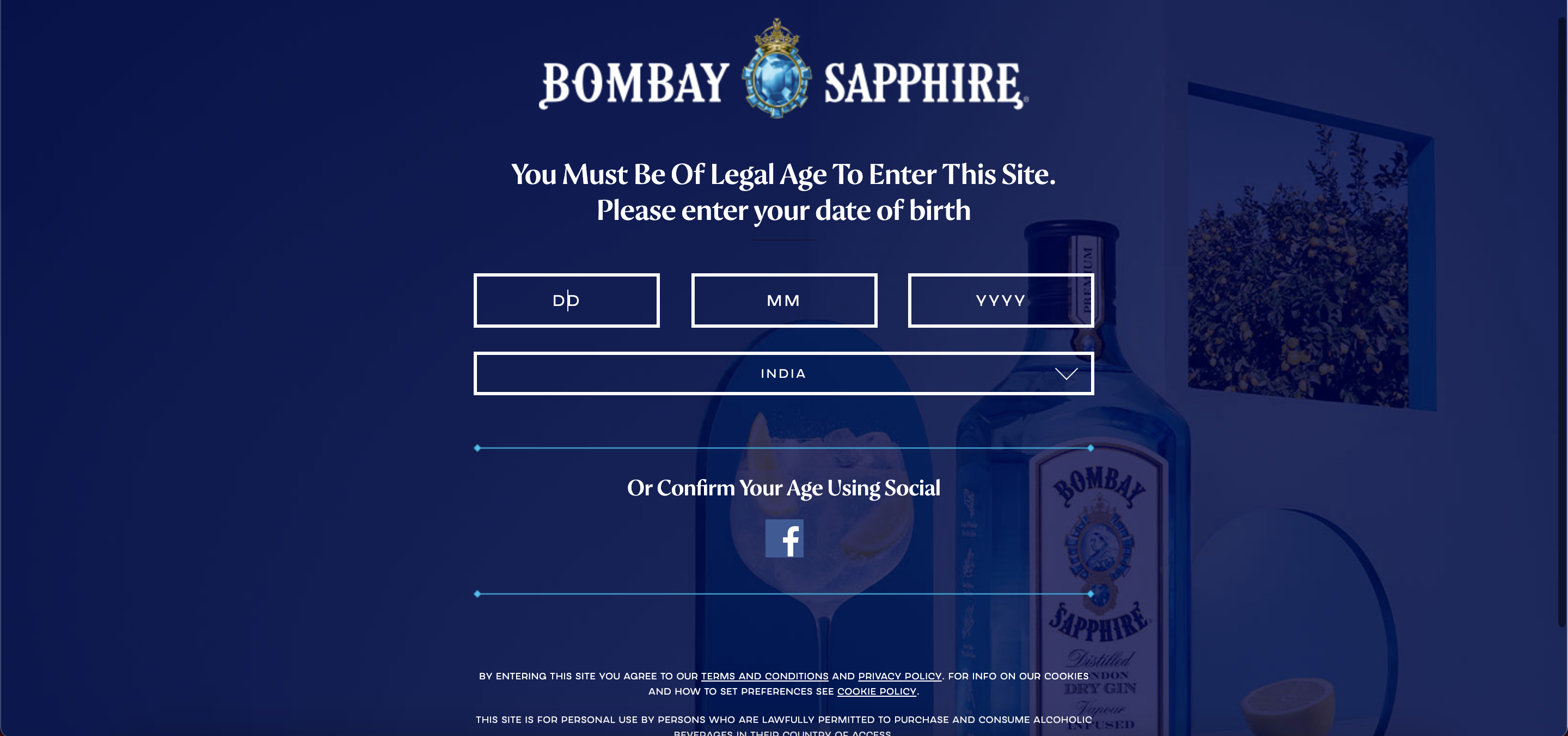 Source: Bombay Sapphire
Bombay Sapphire requires its visitors to enter their birthdate on the splash page. Ensuring that people are of legal drinking age is crucial to any alcohol company. Although splash pages shouldn’t make a visitor do too much work before heading onto the homepage, this is a step that shouldn’t be skipped, especially if it contains age-restricted content.
To ease the person’s process, Bombay Sapphire allows age verification through a social media platform like Facebook, making it a quicker step with just a couple of clicks. Hilariously, if you’re underage and are trying to visit this website, it instantly redirects you to an alcohol consumption helpline site. Funny, yet effective.
2. Email list signup (Yeezy)
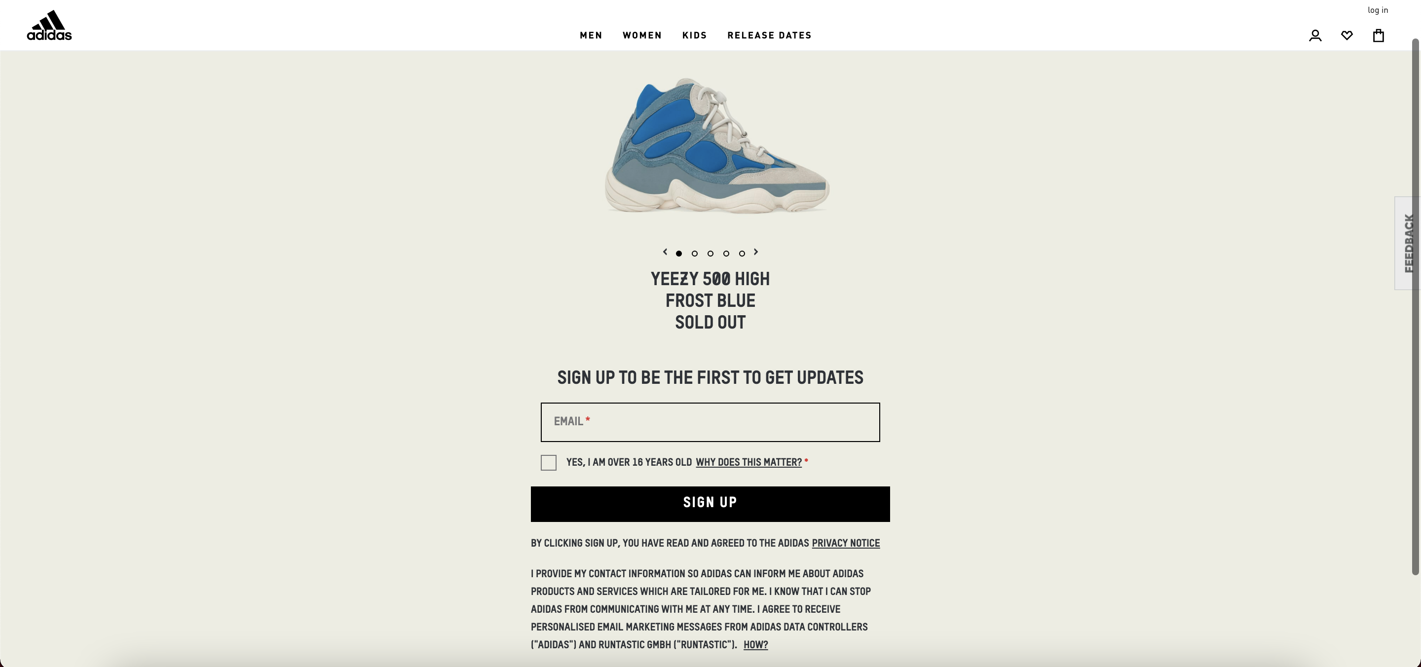 Source: Adidas
Yeezy got this one right with their splash page. Instead of taking you to their site, which would have all the shoe variants displayed as any apparel brand would do, they decide to flex a little bit here.
The first thing a visitor will see is a Yeezy shoe model with the text “Sold out” emblazoned right below the image. What this indicates to a visitor is that their items are coveted and selling out fast. By now, the visitor would feel like they’ve missed out, and again, Yeezy does another brilliant stroke of marketing by offering them a quick solution: Sign up for their email updates. That way, you’ll never have to worry about missing the next stock before it runs out.
Yeezy hits two birds with one splash page: advertising and lead generation.
3. Reinventing navigation (Netrix)
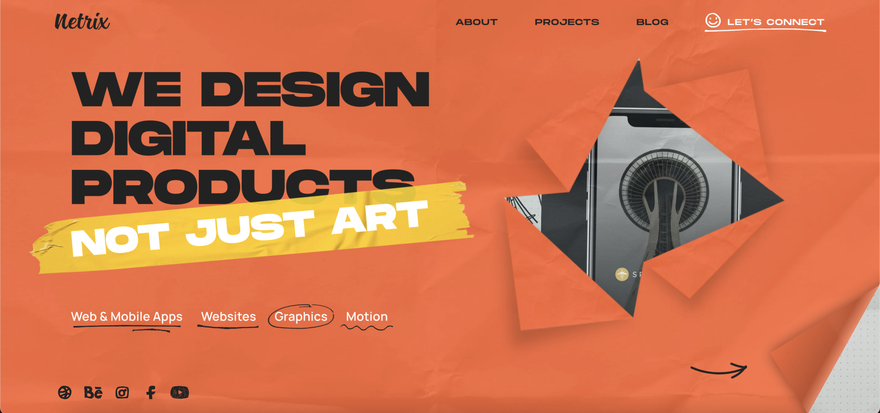 Source: Netrix
Netrix takes a different approach with its splash page. It’s a bright orange page that immediately demands your attention and visually ticks all the boxes. But what’s interesting with this page is how they have no home page and yet have the links to all the relevant tabs available on their splash page. It’s a smart navigation option and gets a lot of things across with the bare minimum content. Netrix has successfully created the feeling of both a catalog and a home page with this splash page.
4. Video montage (Adidas)
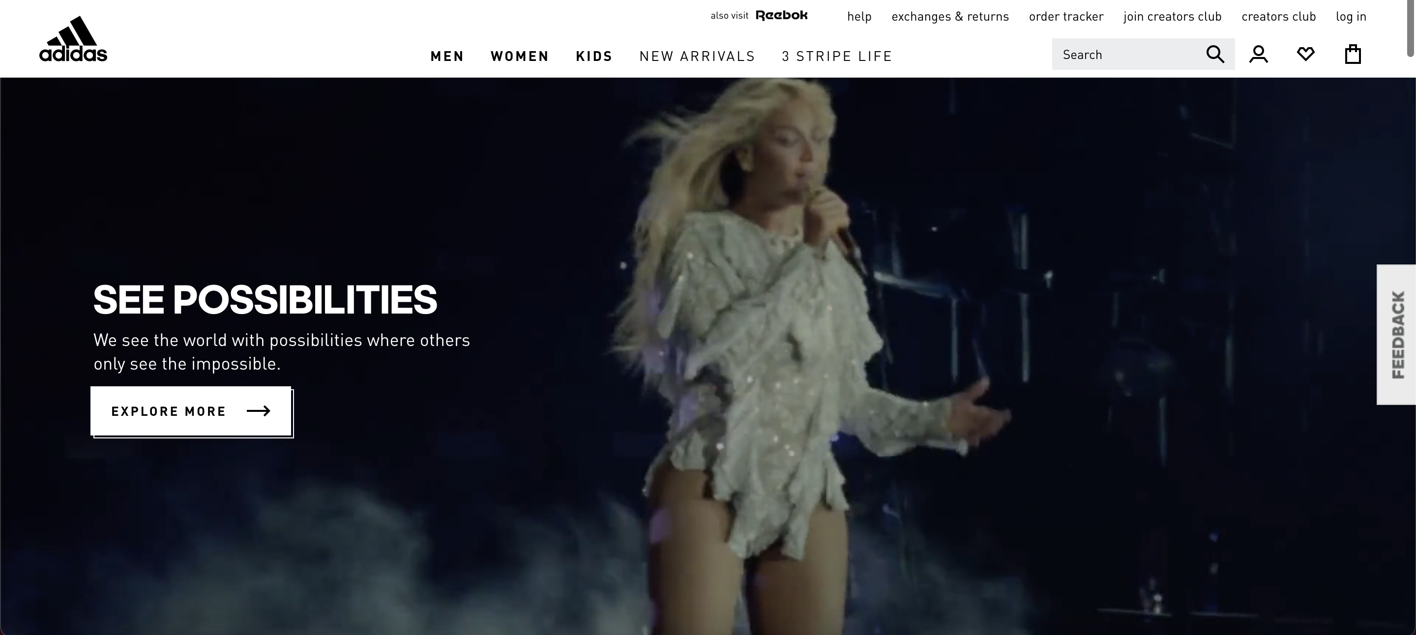 Source: Adidas
Adidas hits people with the feeling of possibility and hopes with its video montage that adorns its page. Visitors are treated to a montage of Beyoncé as a child to the legend that she is today. There’s minimal copy and only one CTA button that takes you to their product site. The rest of the site is just the video playing on loop, doing most of the talking. Not only does this drive home the message that Adidas wants to send to its visitors, but it also perfectly encapsulates the brand and what it stands for. Also, you can never go wrong with Beyoncé.
5. Language selection (Zara)
 Source: Zara
Zara’s splash screen is a great example of putting your users first. As a global brand, they want to make sure their customers get the right information in a language they can understand. Notice there’s no exit link here as it’s a page you have to fill out before entering the site. They use a beautiful background image of a model that goes well with their theme of fashion and visuals. The only thing on this page apart from their logo is the language and location preference, intended to provide users a seamless experience in a language they are comfortable with.
Splash pages have made a comeback
The infamous splash page is now having a renaissance. It's not just a pretty face anymore; it has functionality and a bite now. Splash pages should be a fun addition to your site – for you and your users. They're a great addition to your overall web design. Make sure you keep the entire look and feel on-brand to create the best experience. Once you implement a splash page, make sure to monitor and track it, and don’t be afraid to make changes on the fly.
Does your brand fall under a niche? Explore niche marketing and different strategies that your business can adopt.
Ninisha Pradhan
Ninisha is a former Content Marketing Specialist at G2. She graduated from R.V College of Engineering, Bangalore, and holds a Bachelor's degree in Engineering. Before G2, Ninisha worked at a FinTech company as an Associate Marketing Manager, where she led Content and Social Media Marketing, and Analyst Relations. When she's not reading up on Marketing, she's busy creating music, videos, and a bunch of sweet treats.

