


Coming across an image in a sea of data is an overwhelming relief.
Humans can only take so many words, numbers, and equations before forgetting everything we just attempted to digest.
If there’s one field that’s overflowing with mounds of data, it’s sales. Almost everything in the sales realm needs to be simultaneously quantifiable and easy to interpret, which explains the widespread use of sales dashboards and sales analytics software.
What is a sales dashboard?
A sales dashboard is a visual representation of your real-time sales data. The purpose of a sales dashboard is to provide an easily understandable overview of your key performance indicators, allowing reps and managers to check in on progress toward sales goals and targets.
Sales dashboards come in handy when evaluating performance and making business decisions. Managers look at dashboards to stay updated on the sales team’s performance metrics when they are creating sales strategies, crafting compensation plans, awarding bonuses, and identifying areas that need improvement.
How to create a sales dashboard
Depending on the primary goals of your business, your sales dashboard might look completely different than your competitors’, which is perfectly normal. So long as you know where your priorities stand and follow the steps below, your sales dashboard will offer value to your team.
1. Determine metrics
The first step in creating any kind of sales dashboard is to choose the metrics that will be included.
The best way to do this is to look at your current goals. The point of having a sales dashboard is to be able to check progress on your highly prioritized goals, so it makes sense that those are the metrics you would have on display.
To get started, choose one goal and then pick out a few key metrics that speak to its attainment or failure the most. For example, if one of your primary goals for the quarter is to improve your lead qualification process, you could create a sales dashboard with your conversion rates and activity metrics. Both of these are primary factors in lead qualification, so they should be prioritized on the dashboard.
Do this with each goal you will be striving toward in the upcoming month, quarter, or year. The metrics on certain dashboards might be able to cover more than one goal. Just make sure they don’t get too cluttered.
2. Choose dashboard view
The next step is to identify how the dashboard will be used and by whom.
Is the purpose of the dashboard to keep reps up to speed on their individual goals, or to help managers easily pick out top performers? Consider the different audiences that will be viewing the dashboard, and pick out what they might care to see the most.
Even if the matter at hand is the same (conversions, performance, sales cycle length, etc.), people in different positions are interested in different metrics. For example, let’s say you’re creating a sales conversion dashboard that a rep, a manager, and a C-suite executive will all be using.
- For reps: Because the rep is responsible for converting as many leads into customers as possible, they will want to know how many leads are entering the pipeline.
- For managers: Because managers need to be able to pick out areas in the sales process that need to be improved, they will be more concerned with the conversion rate between each stage in the sales cycle.
- For C-suite executives: Executives are looking for big picture numbers that encapsulate the overall performance of a business so they can relay that information to investors. Their key concern lies in the lead conversion ratio.
The dashboard view can also refer to where the dashboard is being looked at the most, so make sure it’s accessible on desktops, tablets, and mobile devices.
3. Pick a provider
Next, you will need to choose a software that will help you create your sales dashboard. Apart from the sales analytics software, there are other options you can consider. If your business uses a CRM, it likely has a reporting feature that enables you to create dashboards for your team.
Data visualization tools can translate your business’ metrics and key performance indicators in a chart, table, or graph in real time, making performance and progress toward goals easy to interpret.
When picking a provider, make sure the software includes all of the features necessary for your business’ sales dashboard. Some tools have more capabilities than others, and finding the right fit for your business is important before making an investment. Things like real-time updates, historical snapshots, and customization are all important factors.
4. Pull data
With the provider you have chosen, it’s time to import all of that sweet, sweet data!
If you are going to integrate your sales dashboard with your CRM, you should be able to easily sync your data between the two software. Tools like sales analytics software can take data from your CRM to create the required graphs. If your business has been keeping track of sales data manually, you will have to build the report from scratch by importing all of the necessary information into the data visualization tool.
5. Build reports
After you’ve uploaded your data, it’s time to build the sales report. Make sure you have all of the current data you wish to view uploaded into the tool - software can’t read your mind.
There’s more than one way to visualize data, and depending on the information and analysis you are conducting, certain views might be more applicable.
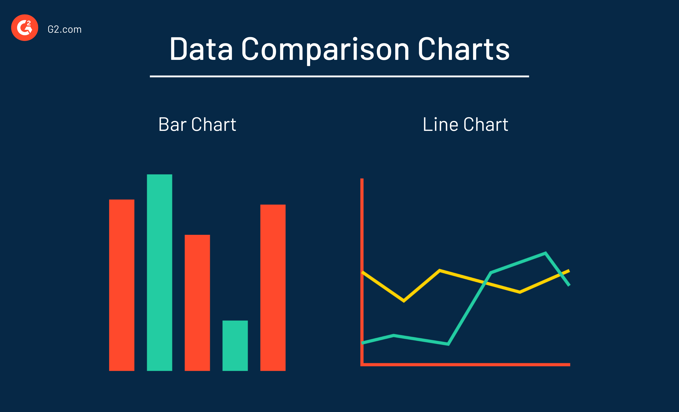
Comparison
A lot of times, businesses are looking to see their growth and progress on a dashboard by comparing the same metric from two different time periods. For example, revenue in Q1 of 2024 vs. revenue in Q1 from 2023.
When comparing data, your best and simplest option for data visualization is either a bar graph or a line graph.
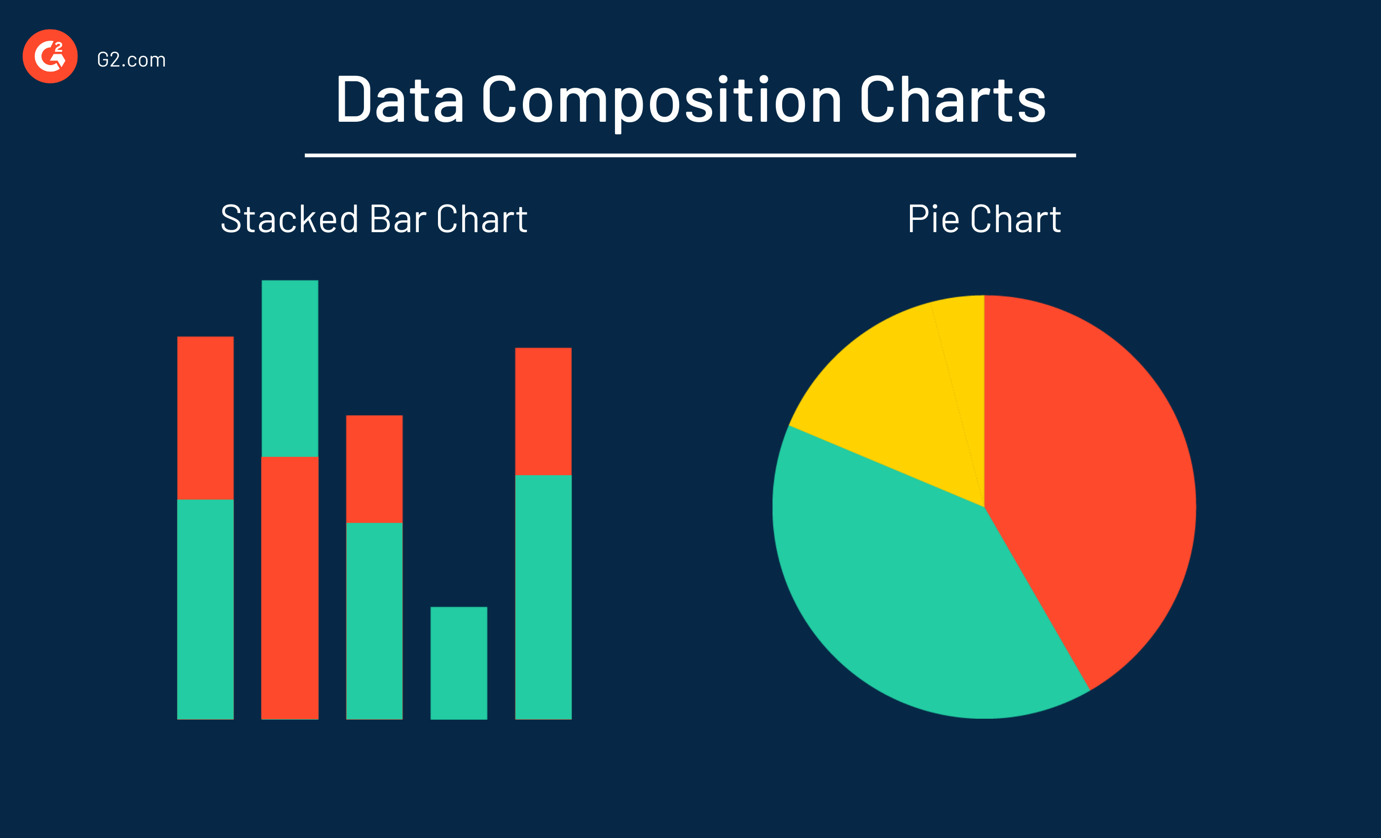
Composition
Businesses are also looking to understand the parts that make up the whole. For example, if the metric at hand is revenue, they will want to see revenue per rep, per product, and per territory. This way, they can see how much a certain rep, product, or territory is contributing to the bottom line and which ones are struggling to pull their own weight.
When looking at the composition of a data set, your best options for visualization are either a stacked bar chart or a pie chart.
Make sure that you choose the right type of data visualization when building reports so the information is as easy to decipher as possible.
6. Share with the team
Lastly, make the sales dashboards accessible to your team. Sales reps, managers, and C-suite executives should be able to customize the view so they can see the metrics that matter to them the most.
Gather feedback from all parties, and modify the dashboard if necessary.
Want to learn more about Sales Analytics Software? Explore Sales Analytics products.
Sales dashboard examples
As stated above, every business is going to value certain goals and metrics over others. However, there are some common key performance indicators that are agreed to be crucial when tracking progress.
Below are some common examples of sales dashboards.
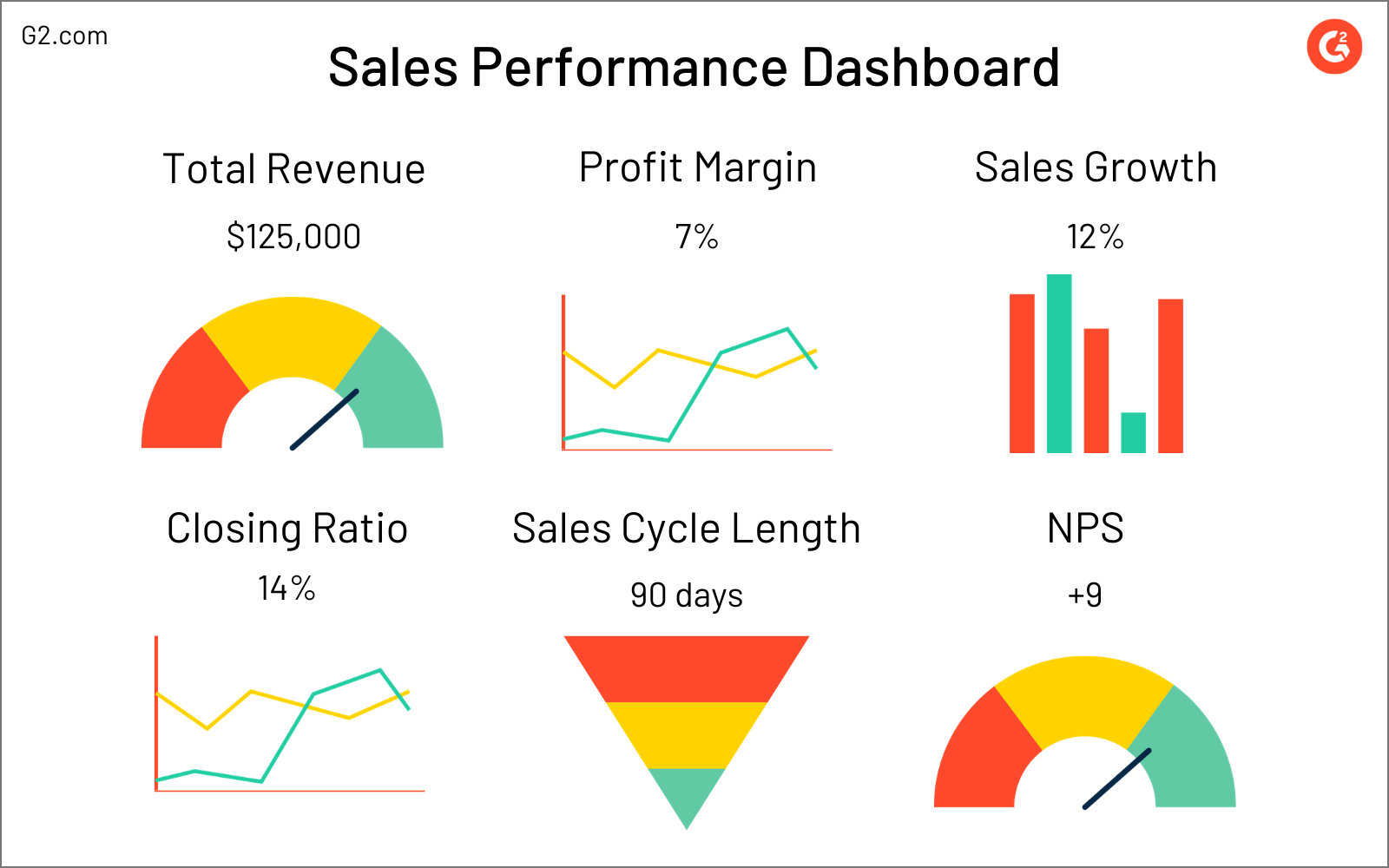
Sales performance dashboard
A sales performance dashboard focuses on the big picture – sales KPIs. Anything that’s seen as an overarching metric that can speak to the performance of the entire business is kept on this dashboard.
These metrics are often the first to be looked at when visualizing progress toward goals and sharing information with important stakeholders. At the end of a month, quarter, or year, metrics from the sales performance dashboard are used to forecast goals for the next period, create sales reports, and identify areas where your team is struggling.
Metrics that are seen as key performance indicators can vary from business to business, so tailor your sales performance dashboard based on what represents true success to your team. Be careful not to include too many metrics as there are other dashboards for tracking more specific values. Below is an example of some common sales key performance indicators.
Metrics tracked include the following:
- Total revenue: the income that a business generates from normal business activities, a key indicator of profitability
- Profit margin: the amount of money left over from sales once cost of goods sold is taken into account, an even better representation of a business’ profitability
- Sales growth: the increase or decrease in sales revenue of two different time periods, showing whether or not a business is growing in the right direction
- Closing ratio: the amount of proposals sent compared to the amount of deals closed, indicating the effectiveness of the sales team
- Sales cycle length: the amount of time it takes to convert a prospect to a customer, which shows how quickly and efficiently your sales team moves customers down the pipeline
- Net promoter score (NPS): an index, based on customer feedback, that shows how satisfied a buyer is with your business
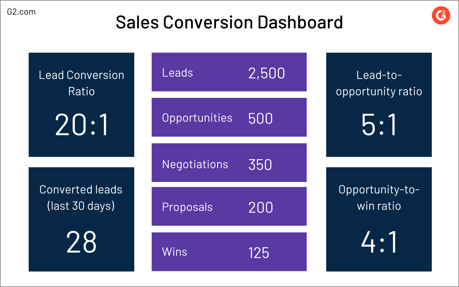
Sales conversion dashboard
The sales conversion dashboard tracks all of the metrics associated with the sales process and buyer journey. In a perfect world, every lead would turn into an opportunity and every opportunity would turn into a sale. However, since our world is far from perfect, it’s important for sales teams to measure the amount of customers making it all the way down the sales pipeline.
When trying to improve your overall conversions, you first must tackle each individual part. Watching the conversion rate between every single stage in the sales cycle will help reps and managers pick out areas of success – and more importantly – areas that are struggling.
For example, your business could have a great opportunity to close ratio, meaning your reps are giving killer value demonstrations, but not have enough leads to support your goals. This valuable insight might change the way you find and qualify leads.
The sales conversion dashboard is essentially a dashboard version of your sales pipeline — you see where each customer is currently sitting in the buying process. Below is an example that covers each aspect of a sales conversion dashboard.
Along with the number of customers in each stage, metrics tracked include the following:
- Lead-to-conversion ratio: the number of leads compared to the amount of deals closed, so basically the number of leads it takes to get one conversion
- Converted leads: the number of converted leads within a specific time frame
- Lead-to-opportunity ratio: the number of leads that convert to opportunities
- Opportunity-to-win ratio: the number of opportunities that convert to closed-won deals
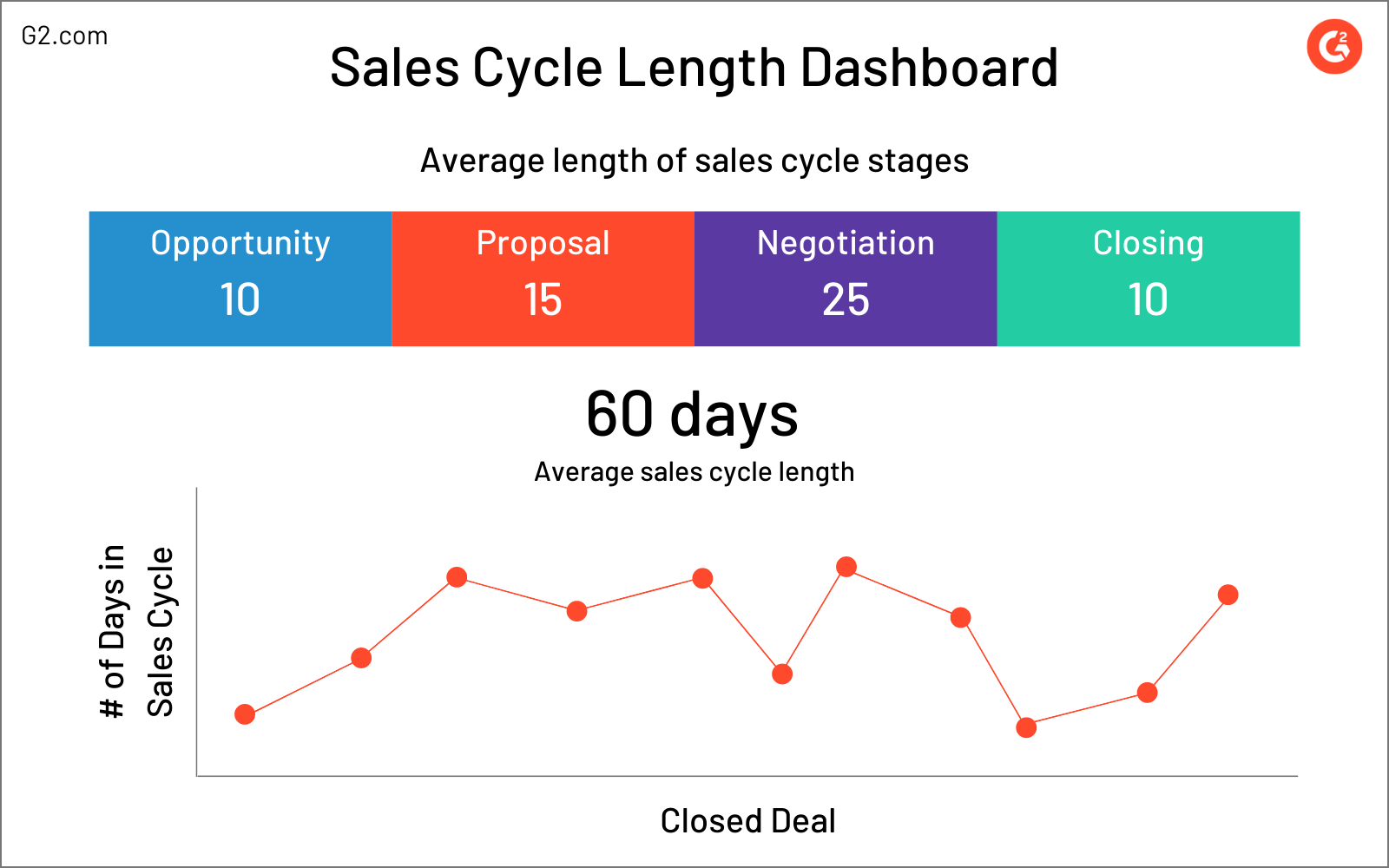
Sales pipeline dashboard
The average time it takes to convert a prospect into a paying customer can speak directly to your conversion rate. If your sales cycle length is too long, customers might hop out due to boredom and slow pace. On the other hand, if you’re moving customers along too fast, they might feel rushed into buying, and therefore, undervalued.
To optimize your sales cycle length to a happy medium that pleases both you and your customers, you first need to understand its current state.
The sales pipeline dashboard divides each part of the sales process into distinct stages that are most relevant to the customer: opportunity, proposal, negotiation, and closing. The point of putting all of this information into a dashboard is to understand the average sales cycle length for your business. With this information, you can assess sales productivity, identify what isn’t working, and find ways to make it as efficient as possible.
Besides the number of days that the average customer spends in a certain sales cycle stage, the key metric here is the average length of the entire sales cycle. This is measured by totaling the amount of days it takes to close a deal and dividing it by the number of deals closed.
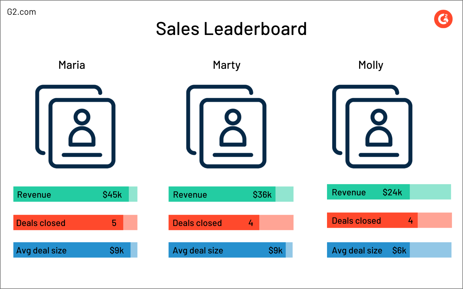
Sales leaderboard
The sales leaderboard dashboard highlights the top performing sales rep at that current moment. Sales reps are competitive, and seeing someone else’s impressive numbers will motivate other reps to kick it up a notch, both individually and as a team.
Some businesses will create sales leaderboards for each role. For example, you might have one sales leaderboard that shows the top performing sales development representative, and another that shows the leading account executive.
Sales leaderboards display the metrics that your business values the highest, so long as they can be applied to an individual rep. Common sales leaderboard metrics include revenue, the amount of deals they’ve closed, and the average size of those deals.
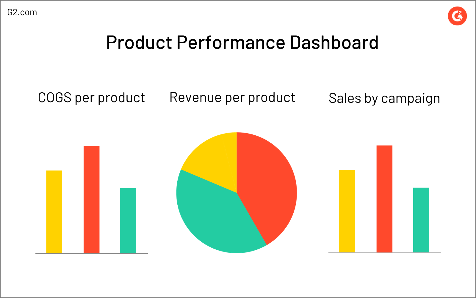
Product performance dashboard
It’s always a good idea to diversify your metrics, especially according to your different products. Tracking the performance of each solution you provide to your customers offers insight into which products are performing well, and which ones aren’t pulling their own weight.
These insights then fuel important discussions. Are we targeting the right audience? Are we focusing too much on a territory that isn’t buying? Is there a common problem customers are facing when using this solution? Do we need to increase our marketing efforts for one product in particular?
Any metric that involves the sales of a solution should be included on your product performance dashboard. Here are some examples:
- COGS per product: the amount of money it takes to sell each solution
- Revenue per product: the income that each solution generates
- Sales by campaign: the method used to attract customers to purchase your solution
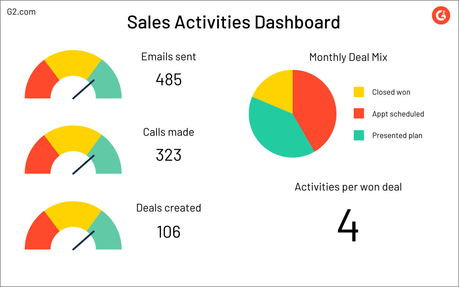
Sales activity dashboard
Sales activity dashboards track the actions of sales reps, yet another dashboard that gets down to nitty gritty details. This dashboard offers insight into what reps are doing daily. Activity dashboards can even be broken down by rep to see who’s carrying the team and who needs to kick it up a notch.
While important, the sales activities dashboard isn’t the first line of metrics being viewed to measure performance. Sales managers will often look to the activities dashboard if other metrics are struggling.
For example, if there aren’t enough qualified leads being poured into the sales funnel to support this upcoming period’s revenue and closed deal goals, there might be a problem with how many lead qualification calls are (or aren’t) being made.
Metrics tracked on the sales activities dashboard are basic day-to-day activities, like calls made, emails sent, and the monthly deal mix, which is a breakdown of the stages where deals are currently sitting.
Another important metric is the average activities per won deal, which refers to the amount of times the business interacted with the customer before a sale was made.
Sales dashboard tips
As you build out your sales dashboard, make sure to keep the following tips in mind. They might make the difference between an effective dashboard or one that confuses your team.
Focus on the layout
The point of visualizing data is to organize and present it in a clean manner. If your sales dashboard is cluttered and disorganized, you’ll find yourself right back at square one.
Don’t overwhelm your sales dashboard with too many colors and details, or you’ll likely distract the viewer from the reason the dashboard was created in the first place: data.
A big part of keeping a clean layout is embracing minimalism. Don’t overwhelm your sales dashboard with too many metrics. Be selective and focus on the values that speak the most to success in that area.
As a rule of thumb, don’t exceed more than 10 data points on a single dashboard. If you find yourself wanting to include more, split one dashboard into two more specific ones with narrower metrics.
Make it easily accessible
The key purpose of a sales dashboard is going to differ depending on who’s looking at it. However, no matter someone’s position at your business, everyone should have access to the sales dashboard. Sales might be the only team directly generating revenue, but every other department can be affected by whether or not those efforts are successful.
Understanding the company’s overall progress is important for every team member, so make the dashboard available to anyone that’s interested in seeing it.
Offer access to equations
As reps look at their sales dashboard, they might want to dig a bit deeper into what goes into achieving a solid average revenue per account, profit margin, and so on.
Be sure to include access to the equations that give the final result. It’s important for reps to know what metrics they need to focus on to have a positive impact on the bigger picture.
Keep it consistent
You should remain consistent when creating dashboards. If a rep is used to looking at a certain dashboard for a piece of data they need to be constantly updated on, you don’t want to move it around, making it impossible for them to find.
The point of using sales dashboards is to have data at the ready, not scattered across multiple platforms. Maintain a level of consistency with naming structures, icons and visuals, date ranges (measuring based on months, quarters, etc.), and even color schemes. Visually, nothing should seem out of the ordinary to sales dashboard viewers.
Use it to motivate the team
When looking at sales metrics, it’s easy to analyze the data and draw conclusions on what needs to be improved. But what about what’s being done well?
Besides acting as a tool to update reps, managers, and executives, sales dashboards can also act as a great way to motivate reps and celebrate victories. Including a sales leaderboard is a great way to entice reps with a little contest or competition.
Offer a prize to the sales leader for that month, quarter, or year. Reps will appreciate the recognition, and others will be motivated to win by selling more.
Show them what you’re working with
Sales teams run on data. Understanding progress toward goals can affect a rep’s activities and motivation, a manager’s decision making, and an executive’s view of the business’s overall profitability.
Start using sales dashboards to visualize your important data and show people what your team can do. Literally.
If you want to take your data visualization a step further, use a business intelligence platform to turn those results into actionable insights that can improve business decision-making and strategy.
This article was originally published in 2020. It has been updated with new information.

Mary Clare Novak
Mary Clare Novak is a former Content Marketing Specialist at G2 based in Burlington, Vermont, where she is explored topics related to sales and customer relationship management. In her free time, you can find her doing a crossword puzzle, listening to cover bands, or eating fish tacos. (she/her/hers)

